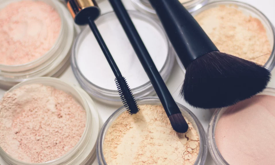
Color can add meaning to a project. Each color has its own meaning. In this case, color palettes are very useful. By using a color palette, you can attract users’ attention. Additionally, set the right mood for a project, and utilize content more effectively.
A project’s color is the most effective way to separate it from the competition or to identify it as your brand. To ensure a good match, you should consider the preferences of your audience when selecting colors.
Color can add meaning to a project. Each color has its own meaning. In this case, color palettes are very useful. By using a color palette, you can attract users’ attention. Additionally, set the right mood for a project, and utilize content more effectively.
The key to success may lie in finding the best color combination for your creation. Therefore, it is one of the most vital steps to create a polished appearance. Using a color palette for your design can make it easier to select the right color.
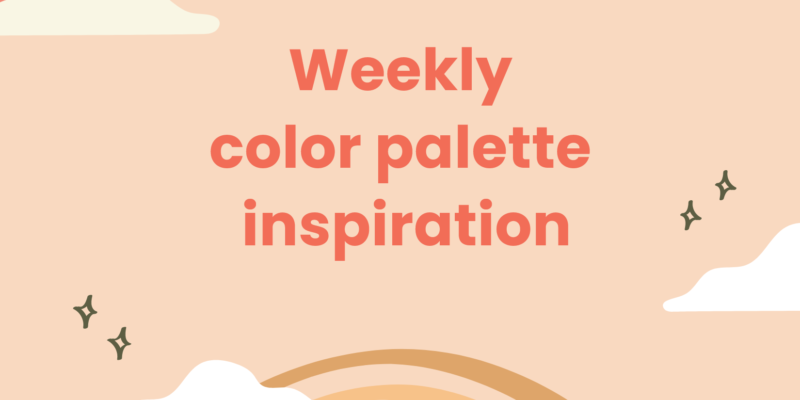
So, I’m here to inspire you by some amazing color palettes that you can use them in your works.
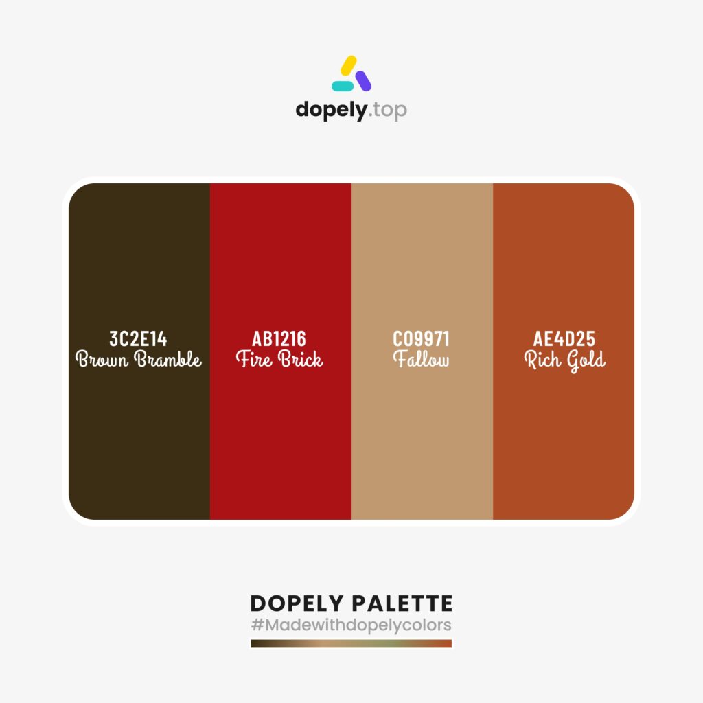
1st Color Palette Inspiration: Girl on the fire!
Color palette inspiration with: Brown Bramble (3C2E14) + Fire Brick (AB1216) + Fallow (C09971) + Rich Gold (AE4D25)
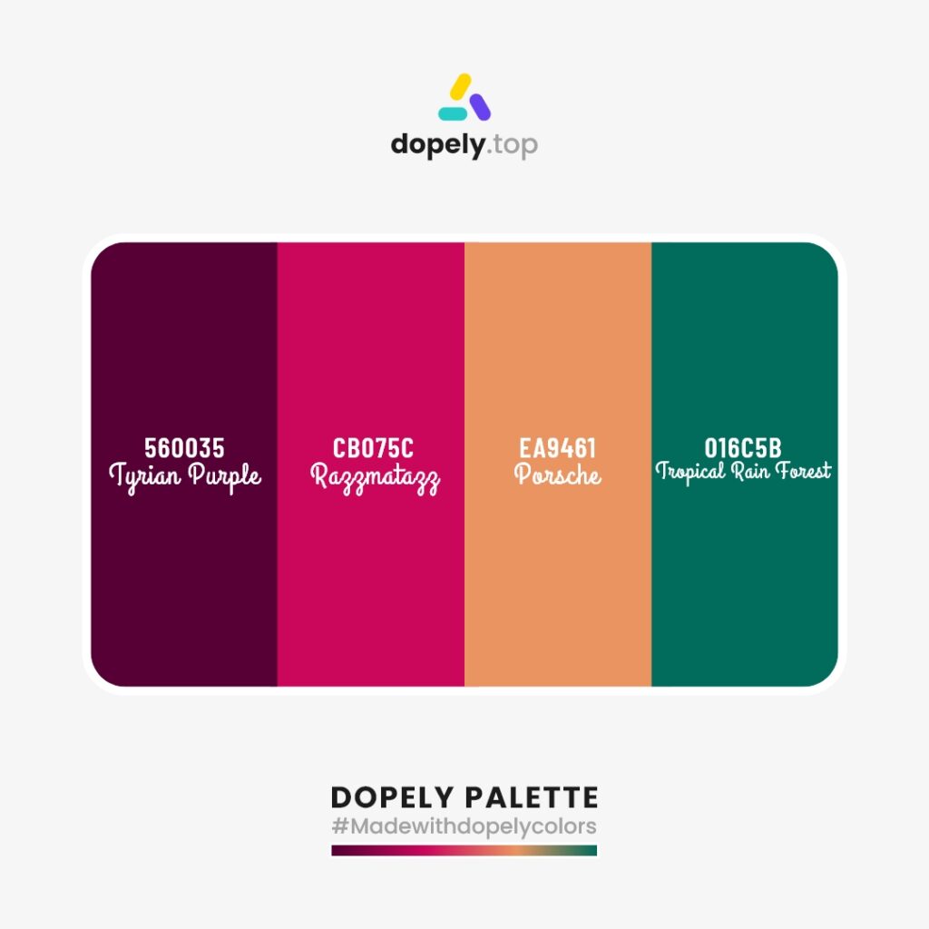
2nd Color Palette Inspiration: Happy summer!
Color palette inspiration with: Tyrian Purple (560035) + Razzmatazz (CB075C) + Porsche (EA9461) + Tropical Rain Forest (016C5B)
3rd Color Palette Inspiration: Old cities!
Color palette inspiration with: Falu Red (5D0C0D) + Buttercup (D88D33) + Antique Brass (724C1F) + Patina (649388)

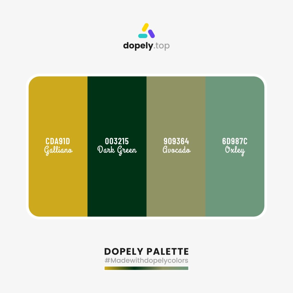
4th Color Palette Inspiration: Avocado tree!
Color palette inspiration with: Galliano (CDA91D) + Dark Green (003215) + Avocado (909364) + Oxley (6D987C)
5th Color Palette Inspiration: Tangerine for an energetic day!
Color palette inspiration with: Buddha Gold (CC9014) + Tulip Tree (E1AC4A) + Tangerine (F08908) + Tenne or Tawny (B56403)

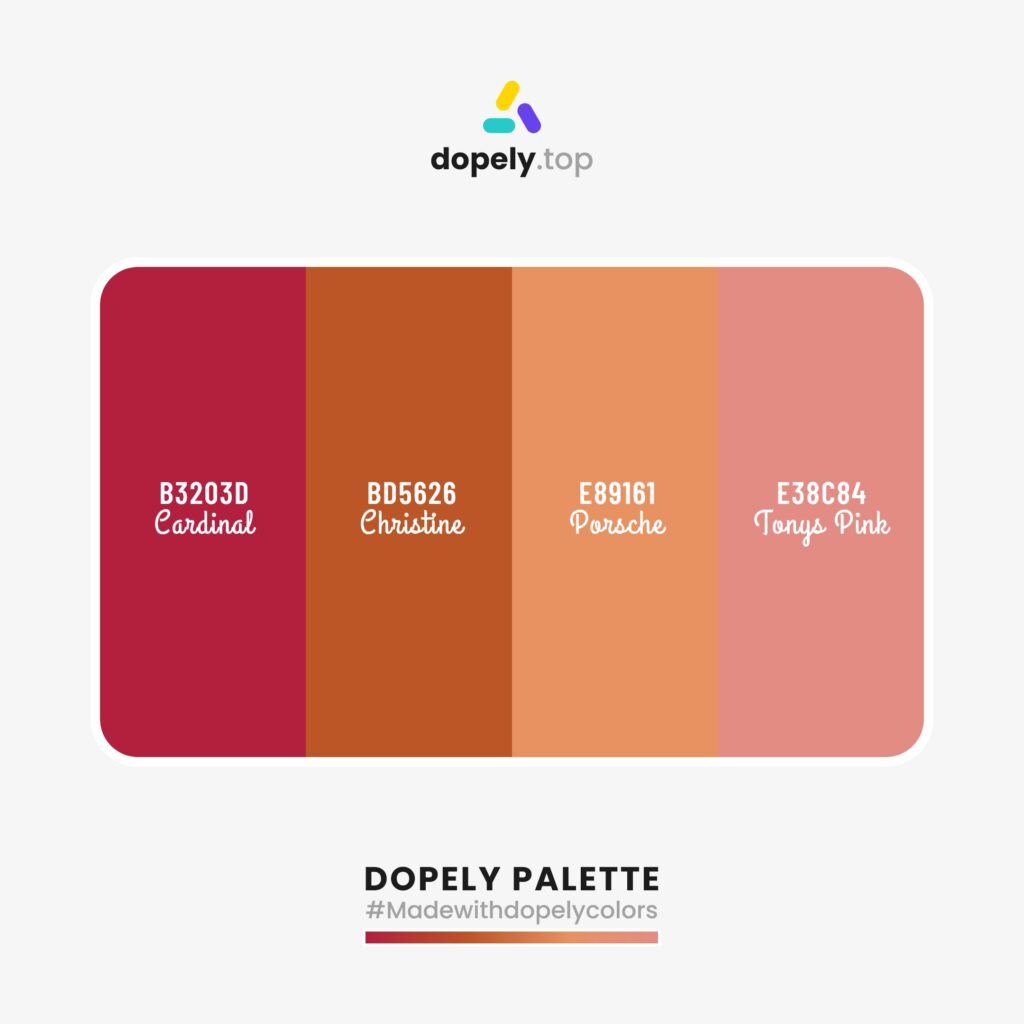
6th Color Palette Inspiration: House of barbies!
Color palette inspiration with: Cardinal (B3203D) + Christine (BD5626) + Porsche (E89161) + Tonys Pink (E38C84)
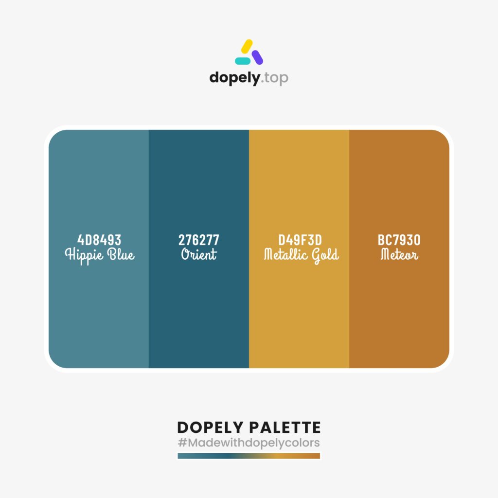
7th Palette: Gold fish in the ocean!
Color palette inspiration with: Hippie Blue (4D8493) + Orient (276277) + Metallic Gold (D49F3D) + Meteor (BC7930)
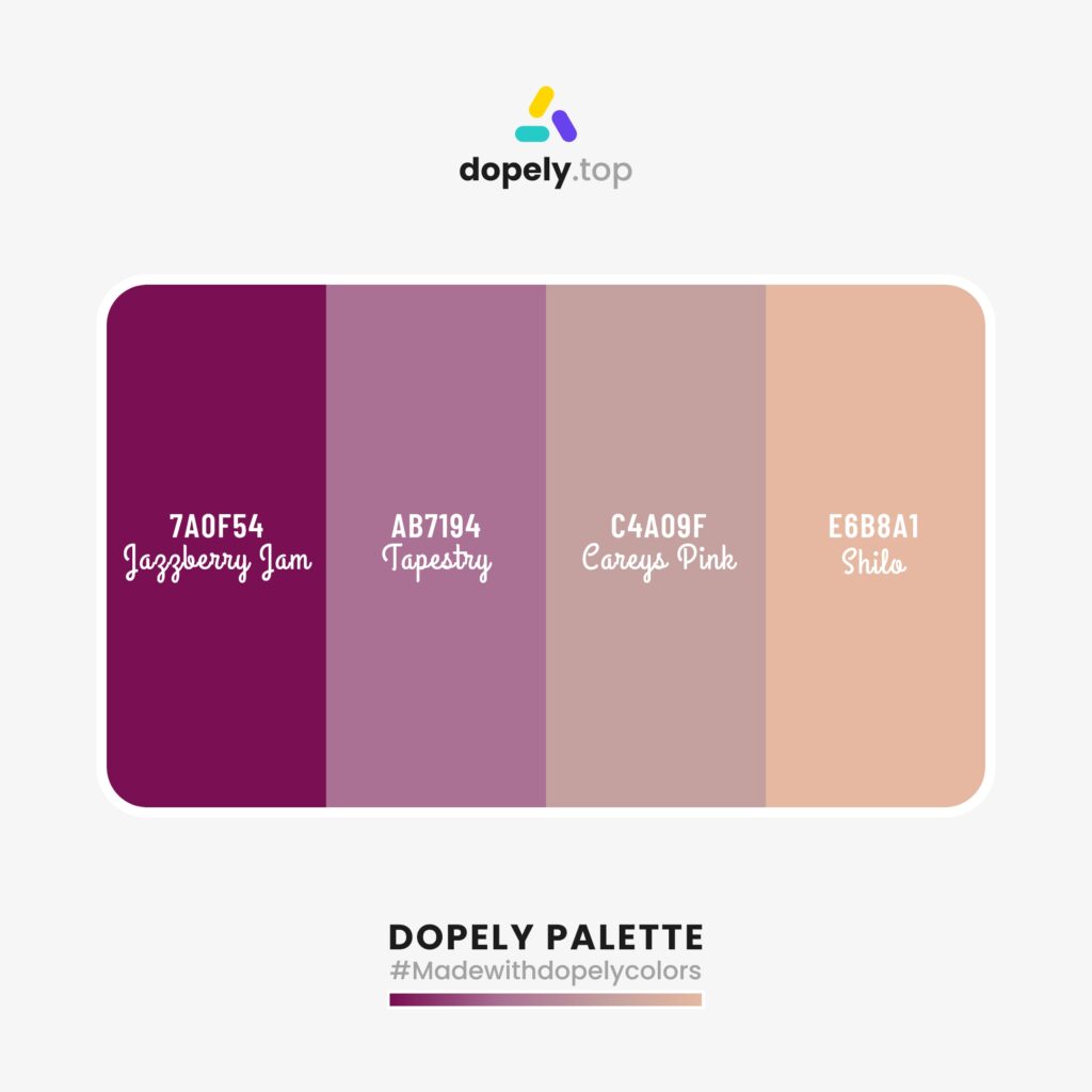
8th Palette: Rich life!
Color palette inspiration with: Jazzberry Jam (7A0F54) + Tapestry (AB7194) + Careys Pink (C4A09F) + Shilo (E6B8A1)
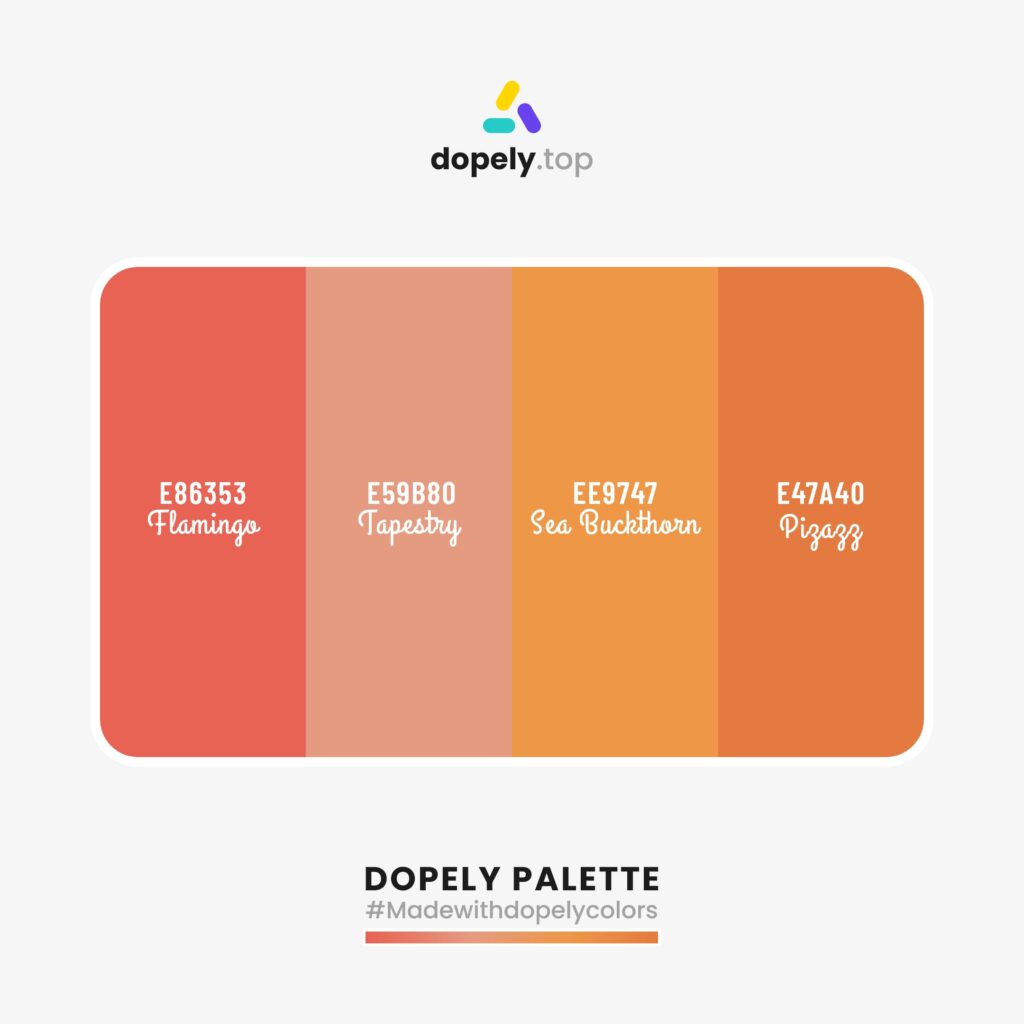
9th Palette: Flamingo!
Color palette inspiration with: Flamingo (E86353) + Tonys Pink (E59B80) + Sea Buckthorn (EE9747) + Pizazz (E47A40)
10th Palette: Cactus under the sunlight!
Color palette inspiration with: Teal Blue (275354) + Tumbleweed (D99B80) + Buddha Gold (CB9014) + Cactus (586957)

Also, for more color palettes you can check Dopely Colora’ website or Instagram account.
Hope you like it!