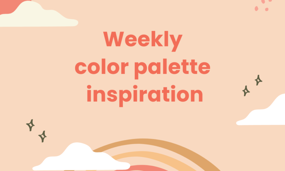
What is a Gradient
Gradient is a bold statement. A way to enhance the depth and dimension of your design. You will feel your eyes relax as you move through the page, flowing from color to color.
The use of flat colors stifles the potential of your design. On the other hand, gradients open up an infinite number of possibilities. It’s not just about the trendy look you’ll have for a while, it’s much more than that.
Colors evoke emotions. If done well, it will result in positive feelings. However, if you make a chaotic cluster of random colors, the emotions you evoke won’t be as pleasant.
This is where gradients can help. With the right gradient, you can cultivate connections, create an impact on the viewer, or even inspire action. Gradients are now a popular choice in web design in a world where we’re looking for experiences.

Types of Gradients
I think it would be wise to get a feel for the landscape before plastering your site with the latest blends.
Gradients come in a variety of types. All of them start with one color and progressively blend into others. Depending on the gradient type, it results in a particular pattern. The area size, shape, and gradient will all have an impact on the final look.
1. Linear
If you think of the word gradient, this is probably what comes to mind. It’s one of the most popular methods. As the color transitions from one hue to another, it is linear.
2. Radial
Radial gradients are circular designs in which the colors radiate from their starting point. Gradients like these are often used in app icons, for example. By adding highlights and shadows, the icons gain depth and dimension.
3. Angle
Around the beginning point, an angle gradient sweeps counterclockwise. The line between the start and end points define the angle.
4. Reflected
The name says it all. Imagine a mirror and you’ll understand how reflected gradients work. Both sides of the starting point have the same color.
It’s a great technique for creating images of glossy objects or items reflected on glossy surfaces.
5. Diamond
As the name implies, this gradient creates a diamond-shaped picture from the starting point. Diamonds have one corner as the end point.
Natural Gradient
Nature is the best way to find beautiful gradients. Inspiration from the natural things that we see everyday around us, can help us to create amazing natural gradients and use them anytime in our works, rooms or style.
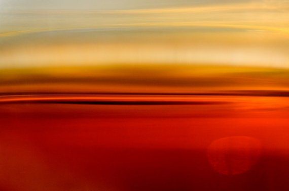
How to find great Natural Gradient
Nature is the best source of inspiration when it comes to finding great gradients. Particularly, the sky. While its most basic colors are blue and red, it actually has so much more to it than just that. The subtle colors emulate waves, the irregular and imperfect clouds ruin and enhance the entire picture, and when the sun rises or sets, the whole scene is in disarray, but everything still works together.
How to use Gradients in modern design
Even though we don’t realize it, we all enjoy this technique when it’s done well. Using it, you can create visually appealing and memorable designs.
The use of various gradients and color blending techniques allows designers to create unique looks for their designs. You can use them as a subtle background polish when you are transitioning between monochromatic shades. Create a bold statement with vibrant colors to emphasize design elements or soften images with a color overlay.
The following are some specific ways to use gradients in modern design:
1. Bring Depth and Dimension
You can achieve a natural effect by highlighting and shadowing a gradient. To achieve a natural appearance, create highlights and shadows. A flat color does not exist in nature, there are always subtle differences in color and transitions between lighter and darker hues.
You can use gradients to add dimension to images, text, and other design elements. In addition to creating subtle transitions and shadows, this type of light source creates a sense of depth.
2. Add Life to Software
Great user experiences help customers navigate the software intuitively. A good gradient subconsciously directs users to the focal point and gives your design some life.
Incorporate subtle gradients into geometric designs to soften them and lend them a more natural and realistic look.
Multi-tone gradients can create interesting and high-impact designs that grab attention. Also, they’re an easy way to add some lighthearted charm.
3. Convey Emotion or Mood
Colors evoke emotions, alter moods, and ignite reactions. We can sometimes use this science to connect with an audience on a deeper level.
Therefore, you need to pick the right colors for your brand. Bright, bold colors evoke positive emotions, such as happiness. Conversely, deep tones can be both calming and confidant, communicating both intelligence and trust.
Tips for designing Gradients
1. Choose the Right Colors
You’re going to need color wheel. Choosing the right tone involves more than picking two random colors. Try out several combinations of complementary shades.
2. Try Out a 3-Stop Gradient Design
Oftentimes, a gradient with two stops causes a dull gray color to appear in the middle. Is there a simple solution? Yes, you can add a third color.
The key is finding a complementary tone that’s not dull gray between the two.
3. Find Inspiration in Nature
Nature is the ultimate source of design inspiration. There’s no doubt that it’s a great source of inspiration for finding complementing gradients. Think of the ocean, sky, or tropical sunset.
It is possible to spend hours drawing inspiration from nature.
4. Study the Right Tools
Get familiar with your design tool, whether it’s a traditional program like Illustrator or a modern platform like Figma. Your skill is what counts, not the tool itself.
You should know how to combine colors. Discover your source of inspiration, and learn about the tools.
The logic of making a beautiful Gradient
Design has been dominated by flat colors for the past decade, but gradient color schemes are now taking over. A brand can express ideas freely by using gradients, which enable subtle transitions between basic colors.
Mark Greenberg, a UX specialist at Resumes Planet, explains it briefly: “After a long period of flat-focused design, gradients come as a natural choice because they offer a variety of styles and improvisations. They introduce another dimension and bring that much-needed depth, which becomes an anchor of modern web design.”
But how do you create a perfect gradient? First, take a look at the color wheel. It gives you a lot of ideas, but almost always the most effective arrangement is to pair adjacent colors. In the wheel, you can see how colors near each other represent a natural transition.
But there are some designers who don’t want or need to follow a particular branding requirement of a company. Simply put, they need to mix colors that are far apart on the color wheel. In this case, an in-between element is necessary to achieve a pleasing gradient.
There is a so-called three-stop gradient, which uses a new color to connect two original colors. Using transparency, shades, and opacity, you can find a custom combination that works for your site.
You can also create soft linear gradients by adjusting the RGB values of the primary colors. Bringing color elements closer together creates a perfectly polished, soft linear gradient.
Things to avoid in Gradient creation
The worst thing you can do is create gradients that are simply not pleasing to look at. You should check all the color options on the wheel and you will see some of them simply don’t go together.
As you examine it, you will realize that the best thing to do is to follow the patterns in nature. For instance, there is almost never a transition between red and green anywhere. As a result, the two colors don’t match, so you should act wisely in this case.
The same is true for orange and blue. Both are incredibly appealing, but they can’t work together. Thus, you should avoid controversial options and focus on finding a combination guaranteed to yield outstanding UX results.
Where to find inspiration for Gradients
The best way to find ideas and inspiration for gradients is to observe nature or search online for good examples. The first option is easy, because you can find a number of incredible scenes every day. From the sky, clouds, forests, flowers, etc.
So, there is no better place to see gradient colors than in nature. You can see so many different hues and shades when watching sunrises and sunsets, when you watch flowers or birds so you can use them in web design as well. For example, you can see this articles for inspiration.
Conclusion
As a result, users first look at a website when they want to check out a company. Therefore, it is imperative that you design your site properly and it has beautiful color schemes. In such a way, gradients play a vital role in giving you more appealing solutions so that visitors will stay for a little longer.
The goal of this post was to show you how to create the perfect gradient and introduce the natural gradient.
Do you know other valuable web design tips? We’d love to hear from you!