How much are you interested in animation?
When I was younger, my brother and I had a lot of fun watching animations. Sometimes we would watch an animation several times and get immersed in the world of characters. We were surrounded by signs of animation, from the costumes of each character to their dolls. But, what feature in the animations made them so special to me and my brother?
Of course there are lots of memorable elements from stories to characters, but don’t forget about the magic of colors!
Colors are the common point between all animations to convey special emotions and messages. Let’s dive into the world of animation again!
The magic of color in animations
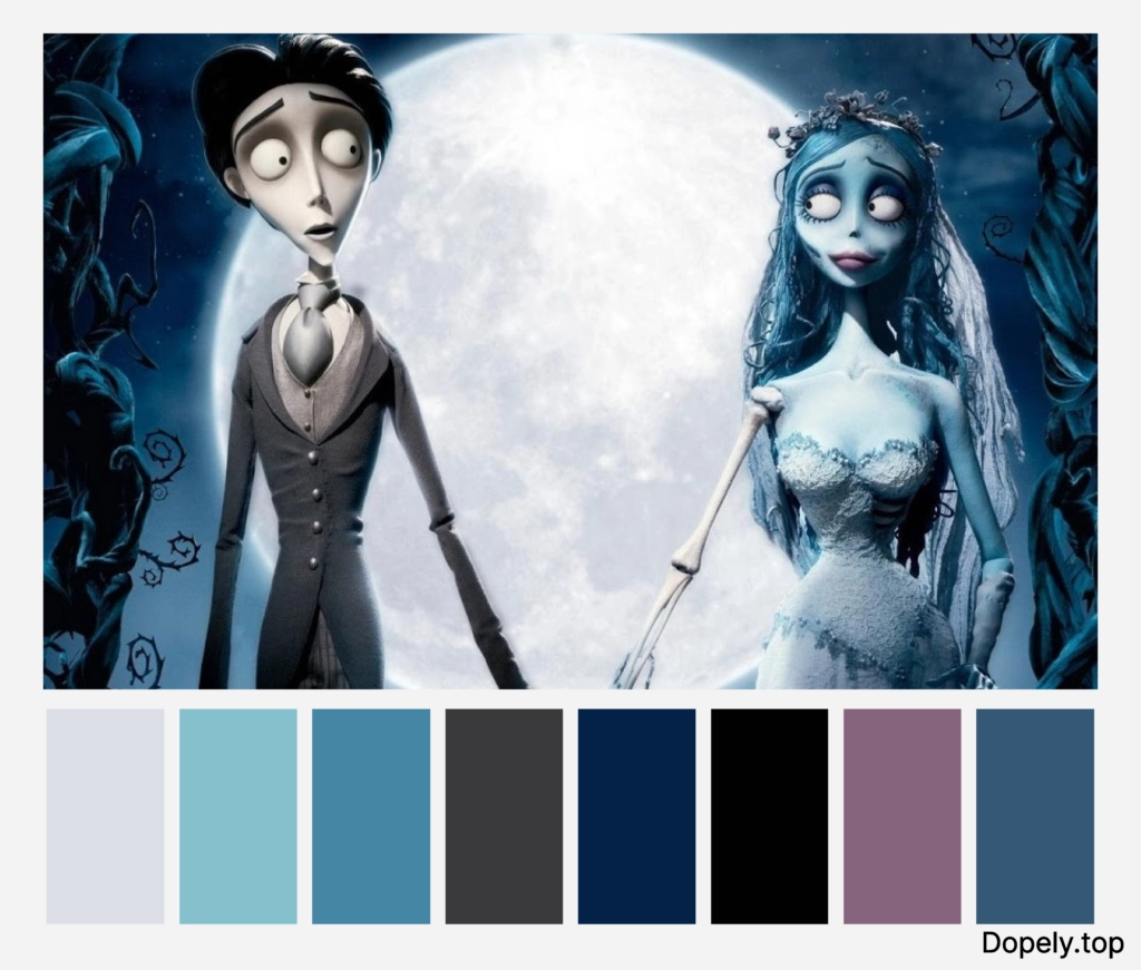
The bride of the dead
The element of color in animation is such an important factor that if there is no color in the animation, that animation has no soul. The colors in the animations convey emotions to the audience.
Of course, there are also colorless animations; specially among the animations of Tim Burton, who is the leader of such animations.
For example, in the animation of the bride of the dead, the predominant color is black and blue, and rarely red or other warm colors have been used, thus creating a cold, dead, insensitive and soulless atmosphere. And in this way it has created an atmosphere.


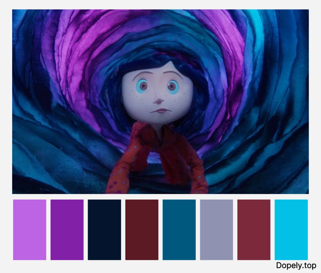
Coraline animation
If the colors are used correctly in the animation, the story can be defined or the positive feeling can be turned into negative and vice versa. Also, the color element is to guide the eye to a part of the image or character.
For example, in this sequence from the Coraline animation, the background contact contains almost neutral colors. Except for the raincoat and hair color of the Coraline character, which is yellow and blue. The use of these two colors attracts the viewer’s eyes to them. The yellow color of her dress conveys the impression that she is happier and more optimistic than the other characters.

In another sequence, when Coraline is passing through the valve, we see the walls of the valve blue and purple. The blue color shows us the coldness and falsity of the world on the other side of the valve, and the purple color shows it to be enigmatic and mysterious.
Ratatouille animation
Sometimes in animations, colors are used to symbolize meanings and to show the atmosphere of a certain period.
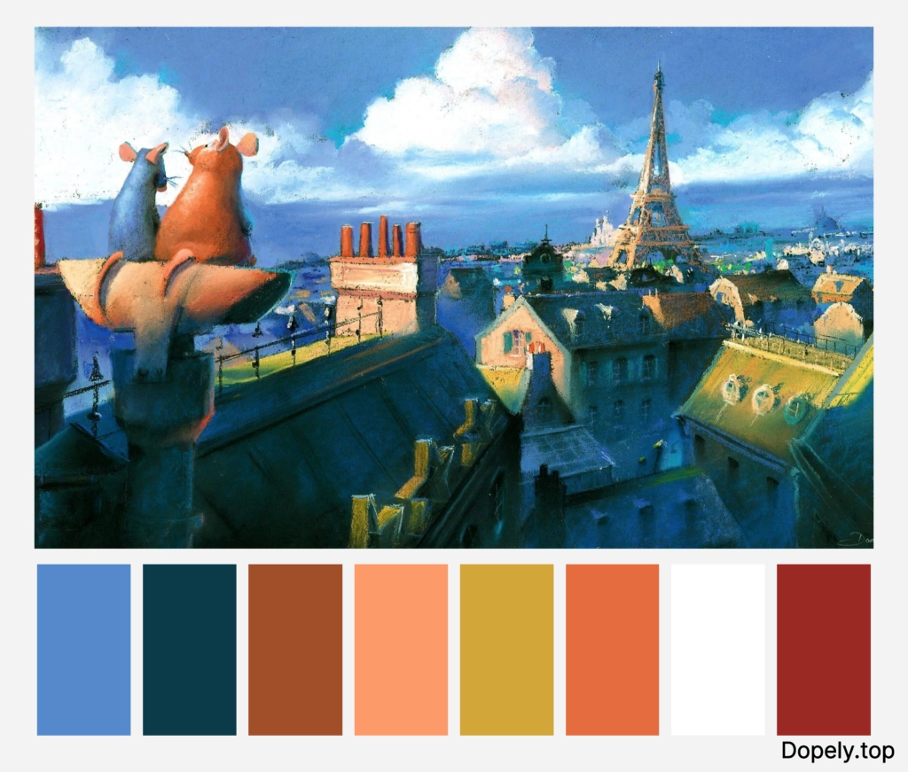
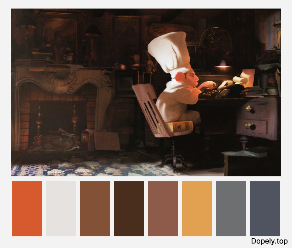
In this regard, we can refer to the Ratatouille animation. If you have seen this animation and paid attention to its colors, you will see that its color script includes tones of sepia and pastel colors.
In fact, the use of these colors is clever and aims to depict Monet, Degas and the Paris Impressionist movement. In this way, they show the atmosphere of Paris at that time.
Color correction process
Usually, the coloring of different scenes in animation and filmmaking is done in several stages, which are called color correction process.
Here are the different steps:
Color script in animations
I explained earlier what colors can affect the audience because they can create different emotions.
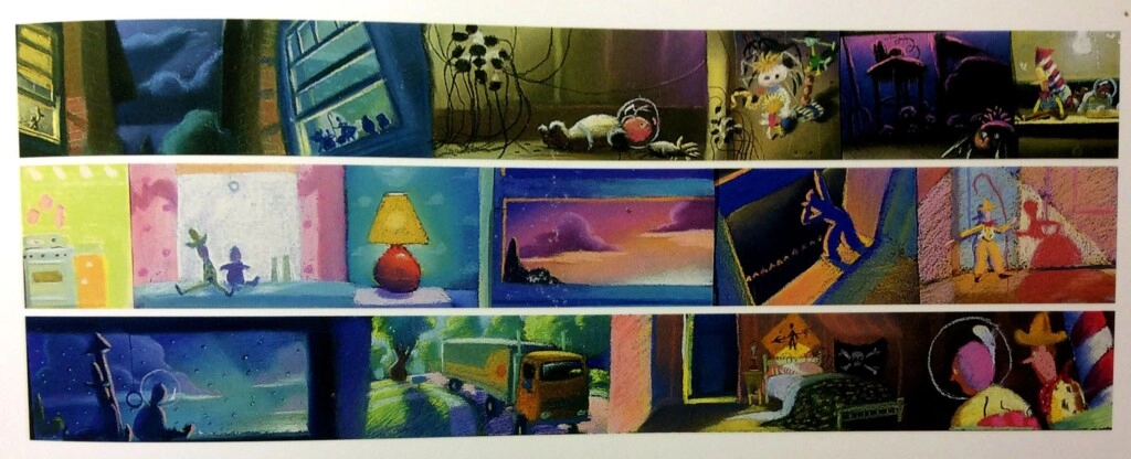
Color script is actually a process that is done to draw the brightness, color, moods and emotions of different scenes of an animation. In fact, in this outline, the use of colors and the brightness of each color are examined and the most appropriate ones that represent the right feeling are selected.
So it is natural that the scripting process is experimental and step by step. It is usually the case that they first consider a single color for the whole project and then gradually replace different colors according to the emotions and the subject they want to convey.
Color key in animations
Artists who specialize in this field paint and design animated backgrounds. They also prepare different designs for different lighting conditions.
Color correction in animations
A set of solutions for editing and correcting color problems in an image is called color correction. In fact, it is the responsibility of this department to eliminate any color deviation. So at this stage, people try to apply colors that are closer to reality.
Color grading in animations
In this section, as in the previous section, the colors are manipulated to bring us closer to the desired color. After color correction that I described in the previous section, we come to color grading.
Indeed, color grading is about creativity. And the goal is to improve the beauty of the project. It can add more colors and change color properties such as noise, saturation and white balance.
What are the basis for choosing animation colors?
Hue:
For each sequence, different hues are selected depending on the emotion to be conveyed. Cool colors to create a cold, sad and soulless atmosphere and warm colors to create a warm, happy and energetic atmosphere.
Saturation:
In addition to choosing the type of hue, choosing saturation, which is the same as the intensity of each color, is also important. As the saturation rate increases, the colors look purer and more realistic. And also, as the saturation decreases, the colors appear washed out or faded.
Value:
Another significant factor in choosing colors is value, which is the brightness or darkness of each color.
It is true that increasing saturation draws attention to the target area, but increasing it too much makes the eye tired. To prevent this from happening, fine-tuning of value is essential. Therefore, it is important to strike a balance between saturation and value.
In the UP animation, in the following sequence, we see that the saturation of the colors is high and the value of the colors is also bright. So, it inspires the happiness of the characters.
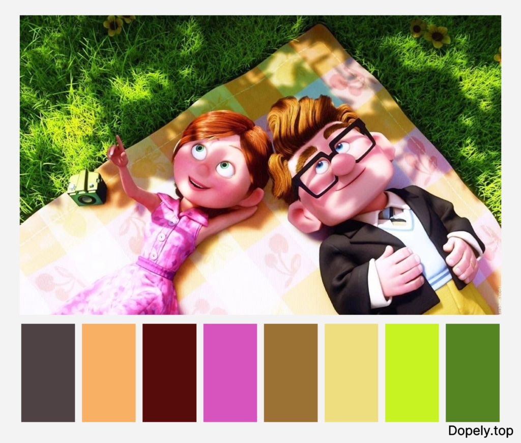
But in the following scene of the same animation, in the sequence where we see the death of one of the characters, the saturation of the colors goes down and the value of the colors goes to darkness. This transmits a sense of sadness and unhappiness to us.

Use color combinations in animations:
The use of a variety of color combinations, monochrome, analogous and complementary…in the animations also creates extraordinary scenes.
Monochrome colors in animations:
In Mary And Max stop-motion animation, we see two different worlds of Mary and Max. Max’s world is a world sleeping in the dark. All the colors used in his sequences are a monochrome combination of black and white. This shows the audience the depression and sadness that is in his life.

After all, Marry is lonely and sad in her world, but unlike Max, her world is not completely dark and black because she is a little more hopeful about improving her living conditions. So, we see his world in color and in sequences as monochrome sepia.

After the two get to know each other, we see that every sign of Marry that reaches Max adds color to his world. And it shows that happiness finds its way into his life.

Analogous colors in animations:
In a sequence from the Finding Nemo animation, we see that the background colors and the colors of both fish are in a special relationship with each other and together they create a suitable color combination that makes the audience pay more attention. Purple, blue, and red are analogous to each other in the color wheel.

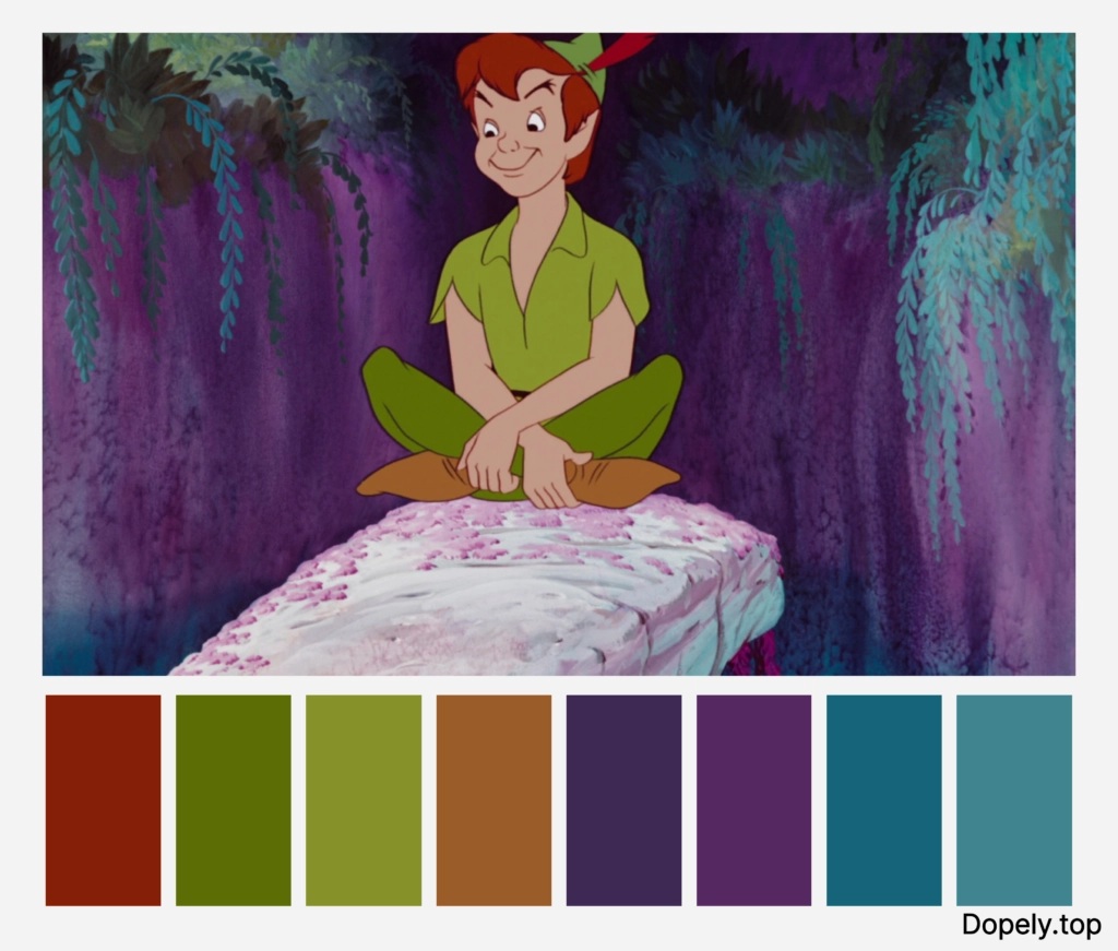
In the Peter Pan animation, you can clearly see the analogous relationship between the blue and purple background colors and the green of Peter Pan’s clothes.
Complementary colors in animations:
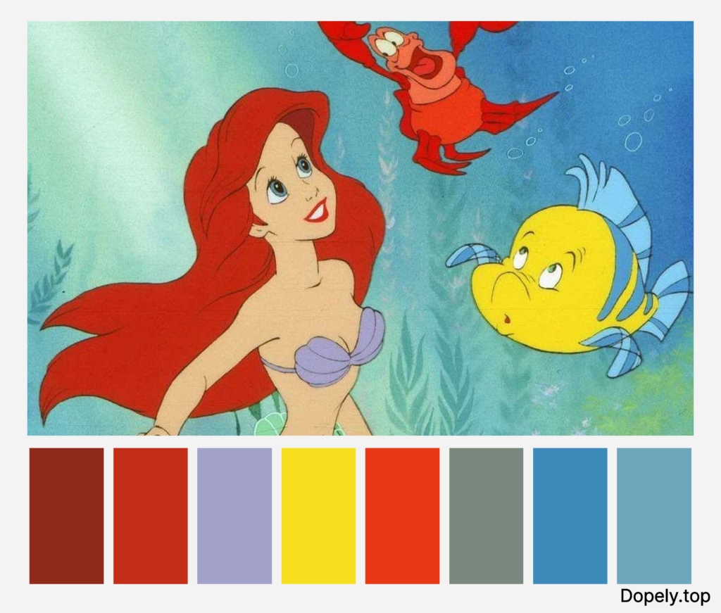
In my favorite animation, The little mermaid, complementary colors of green and red are used to highlight the main character. And in this way, they have given a special and prominent effect to the main character.
In another example, you can look at the Brave animation and its first character, Merida. Her dark green dress and orange hair are complementary colors. In this way, they cleverly showed Merida’s character as important and the first role.

Split-complementary colors in animations:
Snow White animation, a popular and old Disney animation, proves that attention to the relationship between colors has existed in the animation industry for a long time. As you can see, the color of the bow, snow white dress and skirt is in split complementary relationship.

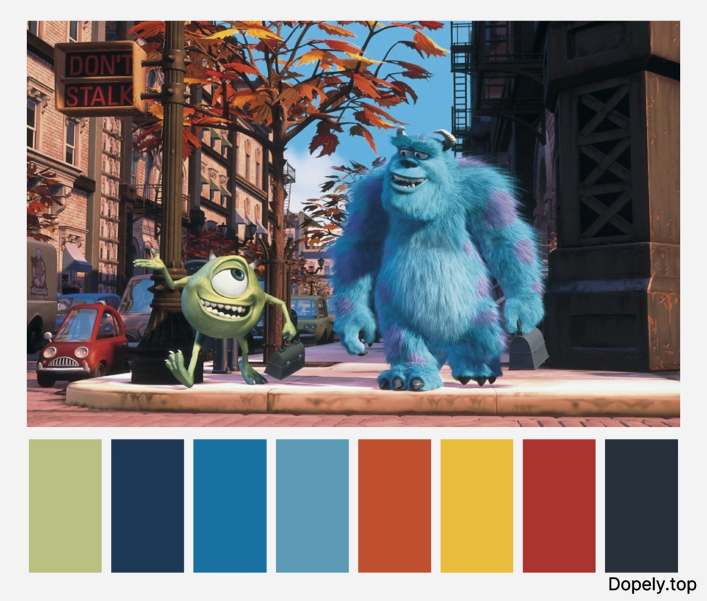
Also in the Monster Factory animation, we see a scene where the two main characters, who are green and blue, are walking on an autumn street in orange. All this is designer intelligence!
Triadic colors in animations:
In another scene from the Finding Nemo animation, the design of the deep ocean is given a Triadic relationship. The presence of blue water, green algae and red corals makes this connection.

Another example of this relationship can be seen in Pinocchio animation. Red pants, a green bow tie, and a yellow shirt and hat show this relationship.

Square colors in animations:
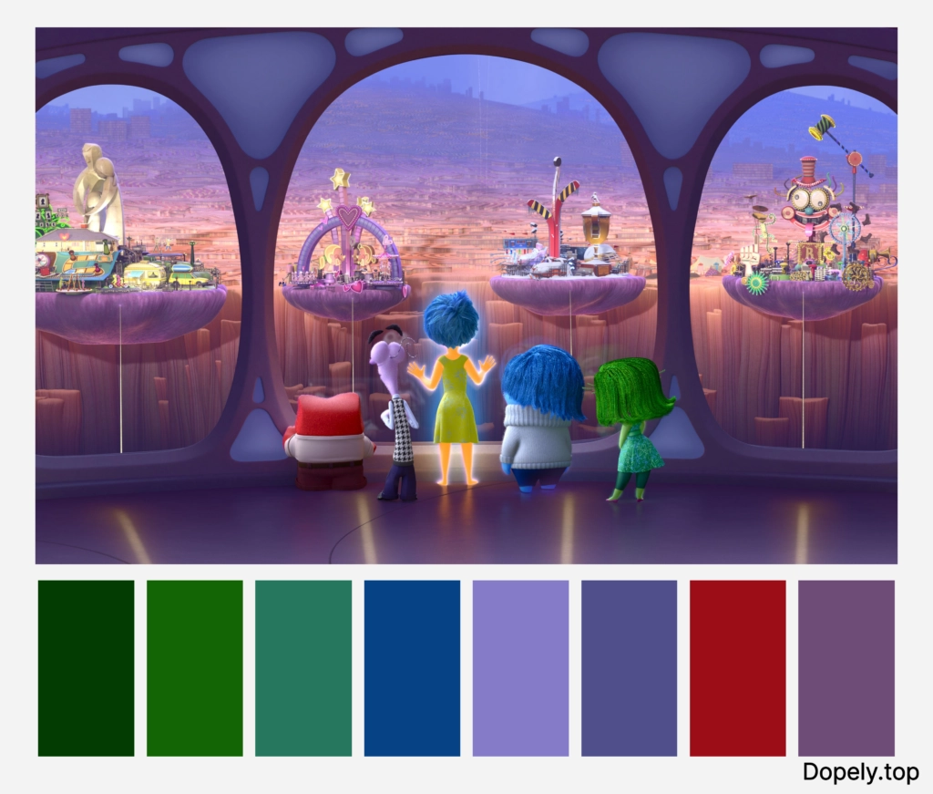
The lilac, green, blue and red colors in this scene from the Inside out animation are in a square relationship with each other. This leads to more attention to the characters of emotions.
Conclusion
The world of animation is very large, but the world of colors is bigger than that.
By using the right color, you can create a masterpiece and put the right message in each animation and show it to the audience.
Maybe this is the feature of animations, which makes its audience not only children!
Tell me, what animation have you seen several times? Or do you still see?


