About Color Contrast Checker Tool
This tool checks the color contrast between the foreground and background of the elements that are on the page according to the WCAG2. Color is a key component of web design and how it is used affects how accessible a website or app is. So, Color contrast is a very important component of creating a more accessible web for all users. To make your text easy to read, the contrast between the text and the background should be high.
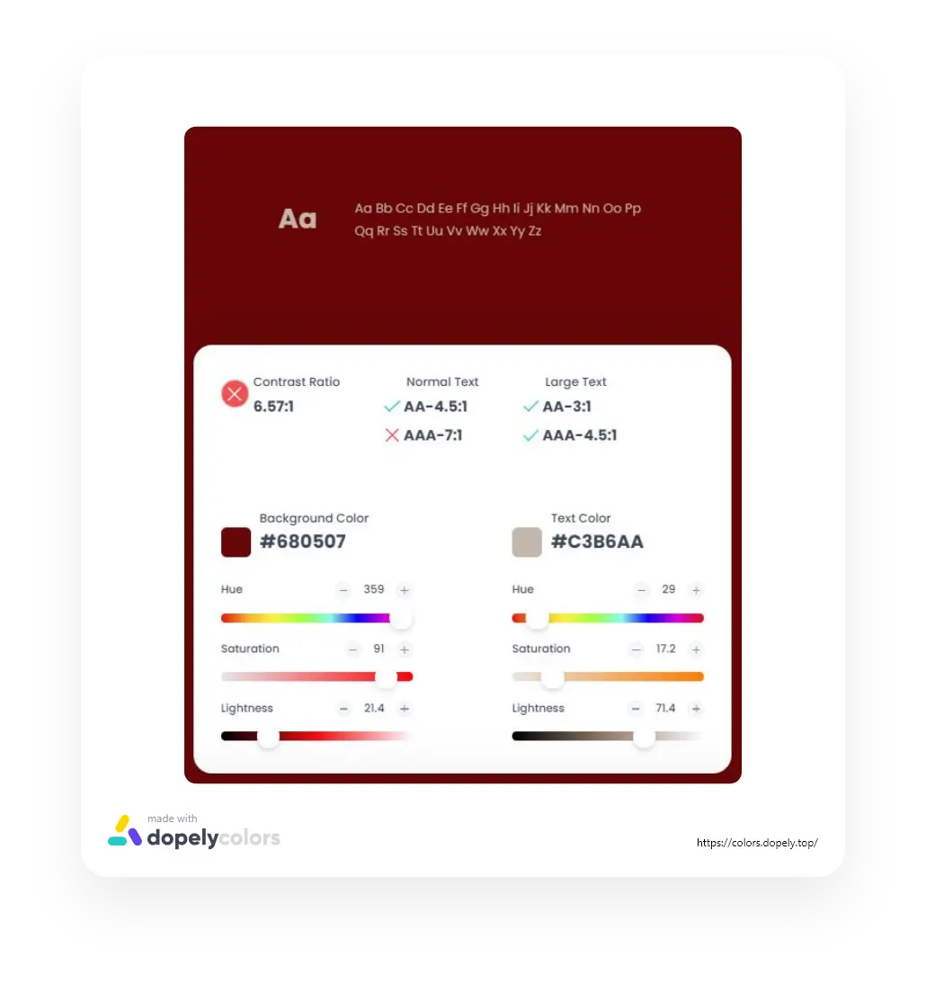
Use this color contrast checker to determine whether your color combinations are accessible or not, and to see if your chosen color combo has the standard contrast ratios.
What is color accessibility?
There is a fundamental design principle in the Web that makes it accessible to everyone, regardless of hardware, software, language, location, or disability. When the Web meets this goal, it is accessible to people with a diverse range of hearing, movement, sight, and cognitive ability. Nonetheless, if websites, applications, technologies, or tool designs are poorly built, they couldn’t be used even by unimpaired persons or search engine crawlers.
Users must be able to perceive the information of different colors on a web page because color has such a significant role in both being visually pleasant and transmitting messages. Color accessibility is significant because it aids users with visual impairments such as poor vision or color blindness in correctly distinguishing content elements and reading/viewing them. Contrast Checker tool tests the contrast ratio of background and text colors for accessibility. Color is an important part of web design since it is used to convey personality, draw attention, symbolize action, and denote importance.
Color and Disabilities
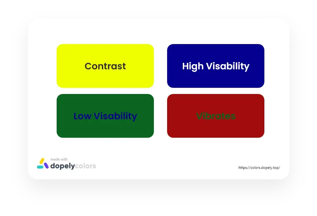
Color blindness is a must to consider while choosing colors. Color blindness affects about 8% of the population, and picking the wrong colors can render your page unreadable for them. Red and green, for example, are two colors that are less appealing than others. For this reason, blue and yellow are typically used, and high contrast between text and backdrop should be maintained. Also, don't rely just on color as a visual signal in your design.
Colors and Texts
Contrast is extremely vital for text. The use of incorrect colors can significantly reduce readability and quickly fatigue the eyes of the reader. The most readable typography is black text on a white backdrop. Blue and white, as well as black and yellow, are two other combinations that are frequently easy to read. As an example, any people find it especially difficult to read green text on the red and red text on the green. Or a vibrating sensation is created by the combination of red and blue, which can make reading difficult.
What Is Color Contrast?
Simply put,contrast is the difference between two colors. The farther apart they are from each other, the higher the contrast. Therefore, complementary combinations will have the strongest contrast, while analogous combinations will have the weakest.
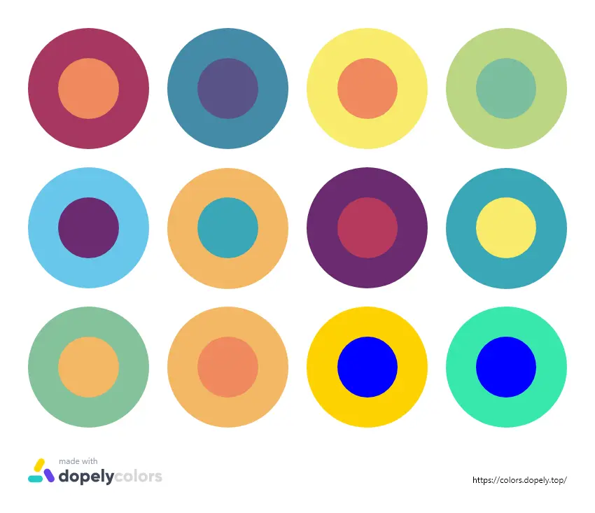
Contrasting colors, also known as complementary colors, are colors from opposite segments of the color wheel. Colors that are directly across one another on the primary color wheel provide maximum contrast.
Colors can contrast in hue, value, and saturation,but various types of contrasts have been determined by color theorists over the years. Here are some of the most important:
Contrast of Hue
Contrast of Tint and Shade
Contrast of Saturation
Combination of Contrasts
The color wheel combinations discussed above are most closely related to hue contrast. The greater the contrast between two colors, the wider apart they are. As a result, complementary colors have the most contrast, whereas analogous colors have the least.When it comes to typography, a color contrast alone is rarely enough to make the text as legible as desired. If that's the case, you might wish to combine hue contrast with another type of contrast.
The contrast between warm and cold colors is a specific example of hue contrast. Cold colors appear to be further away, whereas warmer colors appear to be closer, due to the way the human eye works. This suggests that using a warm color for a symbol is a good option.
When it comes to establishing enormous differences, value contrast is quite efficient. The most extreme contrast, black and white, can be described as a value contrast. Large differences in lightness are generally pleasing to the eyes, while low value contrasts can be effective for more subtle variances, such as in the background.
For design elements that do not require a lot of focus, saturation contrast is frequently preferable.Transparency can be defined as a collection of colors with varying saturation on a grey background. This is a technique that can be utilized to create an intriguing effect.
While any of the contrasts listed above can be used effectively on its own, it is more typical to use a combination of them, especially for text. This creates a vivid mix that can be eye-wearying. You can make a combination that is much more attractive to the eye and readable by adjusting the value and saturation.
Working against the colors' inherent values can have negative consequences. Yellow, for example, is naturally lighter than its complementary color, blue. It would be weird to have a yellow-blue combo.
What Is Color Contrast Ratio?
Color contrast ratio refers to the difference between the light levels in the foreground and the background, a measure of contrast in web accessibility. Due to the fact that colors are generated using unique codes on the Internet, we are able to accurately compare and analyze those codes off each other, resulting in a ratio.
Why Contrast Matters?
Sometimes after spending a long time in the sun or being fatigued from using a computer or mobile, your eyes yearn for a contrasted screen or inversion of color. Color blind people can often become sensitive to certain colors or shades of light and even experience physical pain when the color of the text and the background of the page they are looking at, have no contrast.
The contrast between white and black is the highest and safest level of contrast between the two colors. But sometimes, depending on the situation, you may not want to use these two colors and may need two other colors that have the best contrast for the comfort of the eyes.
What Does Color Contrast Mean For Web Accessibility?
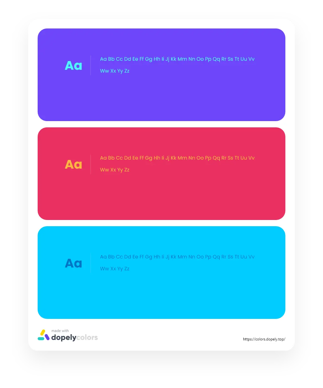
The use of complementary colors on the Web is about finding shades that provide enough contrast between the content and the background for people with low vision impairments or color deficiencies. The colors should not only be limited to contrasting colors but instead, there should be a level of contrast in body text, logos, and essential diagrams or other pieces of content.
What is WCAG?
The World Wide Web Consortium (W3C) developed the Web Content Accessibility Guidelines (WCAG) in collaboration with people and organizations from around the world, with the goal of providing a single shared standard for web content accessibility that meets the needs of individuals, organizations, and governments internationally.
WCAG describes how web content can be made more accessible for people with disabilities. Web “content” generally refers to the information in a web page or web application, including:
Natural information such as text, images, and sounds.
Code or markup that defines the structure, presentation, etc.
The Best Level of Color Contrast Ratio
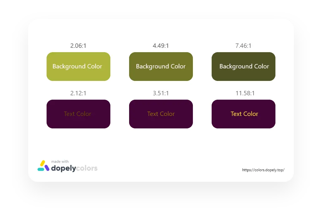
In WCAG2.0, the Color Contrast Standard describes the set up of requirements for AA & AAA conformance levels. The minimum contrast ratio for normal-sized text is 4.5:1 in compliance with the Web Content Accessibility Guidelines (WCAG).
The contrast between two colors is measured by a grading system known as 'levels of conformance' . The strongest possible grade is AAA, and this is achieved with a contrast ratio of 7:1.W3C state s that although it is not always possible to achieve the highest level of conformance across an entire website, the goal should be to achieve the highest level of conformance in critical areas throughout a site, including headlines and body text.
So:
- Section 1.4.3 Contrast (Minimum): Level AA
- For body, subtext, or general copy, the goal is a contrast ratio of approximately 4.5:1 For headers or larger text (Font size 18pt or 14pt bold), the goal is a contrast ratio of approximately 3:1
- Section 1.4.6 Contrast (Enhanced): Level AAA
- Recommended for an expected audience that has aged or low vision.For body text, the contrast ratio can be enhanced from 4.5:1 to 7:1
WCAG Color Requirement For Image
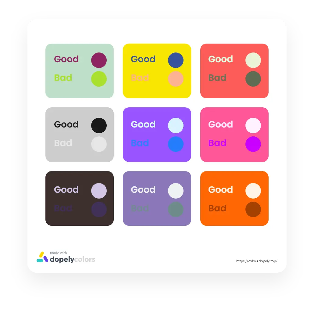
Images must pass the WCAGcontrast requirements. Images that contain text must ensure that the contrast between the image background and the text is sufficient, especially if the images are of low quality and if the image needs to be enlarged in any way. Images of text must have a minimum contrast ratio of 4.5:1.
For images that do not contain text, but still convey meaning, the image components must still have sufficient contrast to ensure that the overall image is perceivable. WCAG2.1 level AA specifies that graphical objects and author-customized interface components such as icons, charts, and graphs, buttons, form controls, and focus indicators and outlines, have a contrast ratio of at least 3:1.
Features
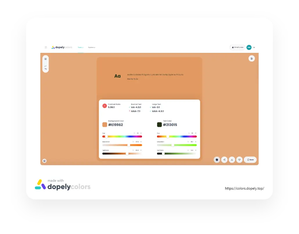
Color Contrast Checker is a tool that tests the contrast ratio of your background and text for accessibility. It will also indicate if the colors pass the newer WCAG2.0 contrast ratio formula. You can use color contrast checker to determine whether or not your color combinations are accessible or not.
Dopely’s Color Contrast Checker helps you determine the accessibility of your text size, color contrast, and spot checks your visual elements.
We evaluate your color combination based on WCAG guidelines for contrast accessibility.
If your combination does not meet the guidelines, we find the closest combination that meets the guidelines by modifying the color lightness. To keep the color as consistent as possible, we only modify the lightness value.
Helps
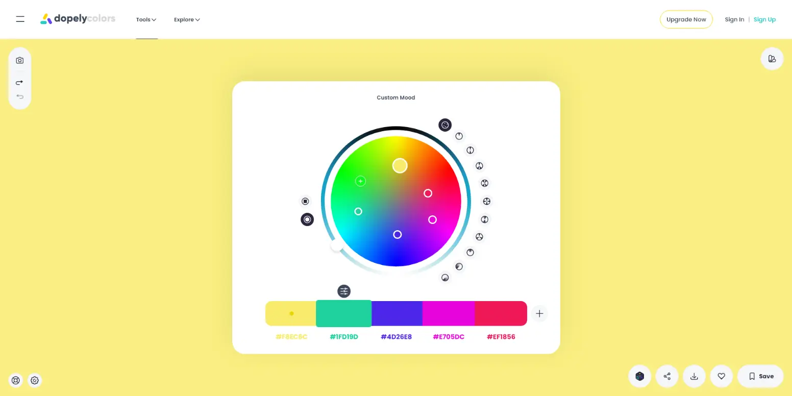
To get started with this tool, you can click on the camera icon and select the photo you want.
- There are two options for doing this:
- Select “Image to color” and then select or drop the image
- Enter the URL

Or you can manually enter your desired color code (hex) in the “Background Color” and “Text Color” fields. Sometimes, it is more convenient to enter color values by hand.

In the next step, you can adjust the contrast of your text using the roller in Hue, Saturation, and Lightness parts.
After each adjustment, check the Contrast Ratio for Large text and Normal text.
If a blue check is placed next to each component, the Contrast Ratio of your text is OK.
If a red X is placed next to each component, the Contrast Ratio of your text is not OK.
