


With the start of each year and the announcement of the Pantone Institute about the color of the year, people who are looking for fashion, try to use that color in their clothing and decoration.
How about you? How far do you go with fashion?
Do you know the reason for choosing each color for each year? Why does the Pantone Institute choose colors every year?
Looking at the color of the year, the last ten years, we come to the answer to all these questions!
Why does Pantone choose the color each year?


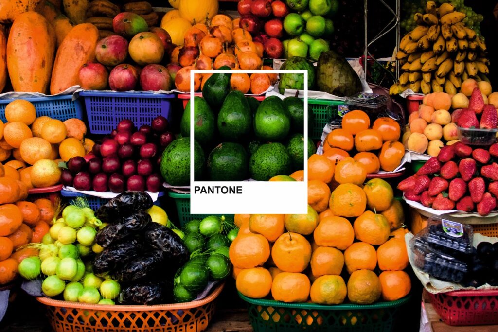
Previously, let’s start with this question: What does Pantone mean? Pantone means All colors. The Pantone Institute is the most prestigious color institute in the world. Indeed, all industries, including the printing industry, the fashion industry, decoration designers, receive the information and color codes they need to produce their products, from this institute.
Pantone is the creator of a standard system called the Pantone Color Matching System (PMS).
With this system, Pantone is the communication channel for all designers and industries around the world to ensure their chosen color.
How does Pantone choose the color each year?


Since 2000, Pantone has been responsible for announcing the color of the year. Twice a year in the European capital, Pantone hosts representatives of standard color groups from different nations.
Meetings are held privately in a room where all the walls and furniture are white. This is because even though there is no color, the idea is not instilled and repeated.
After discussions between the delegates, a color is finally chosen and Pantone chooses it as the color of the year.
Let’s take a look at 12 colors of recent years:
What are the Pantone colors of each year?
Pantone color of the year 2011:


Pantone announced the color Honeysuckle as the color of 2011. It is a reddish pink with a blue undertone.
This color is from the plant of the same name, which is why its name evokes its sweet aroma and taste, and for this reason, it conveys a positive feeling to the audience. This color is not aggressive or passionate, but it is irritating and complex.
The reason for choosing this happy color is pumping adrenaline. It is a color that can give energy to the audience and lift the spirits in bad and difficult situations.


Pantone color of the year 2012:

With the announcement of Pantone, the color Tangerine Tango was chosen as the color of 2012. This color is reddish orange.
This color is reminiscent of the bright shadows of the sunset, a bold and vibrant color. So, provides the energy needed to move forward.
The reason for choosing this vibrant color is, this color can give joy to sad people in addition, freshness to sad spaces and caress the eyes with its radiance.

Pantone color of the year 2013:

Emerald was chosen as the color of the year.
This color is the color of balance and harmony. Also, this color is lively and radiant, glorious and has elegance and beauty.
The reason for choosing this color is that Emerald color is from the green color family and green is the most abundant color in nature. In addition, the human eye sees the green spectrum more than any other color.
Emerald color gives the audience a feeling of clarity and rejuvenation.

Pantone color of the year 2014:

Pantone announced the color Radiant Orchid as the color of 2014. This color is a combination of pink and purple.
This color, which is taken from orchid flowers, is a symbol of freshness, happiness and joy. It also inspires confidence, great joy, love and health.
This color is an invitation to innovation, increasing creativity and originality, which is increasingly valuable. Without a doubt, this is the reason for choosing this color.

Pantone color of the year 2015:

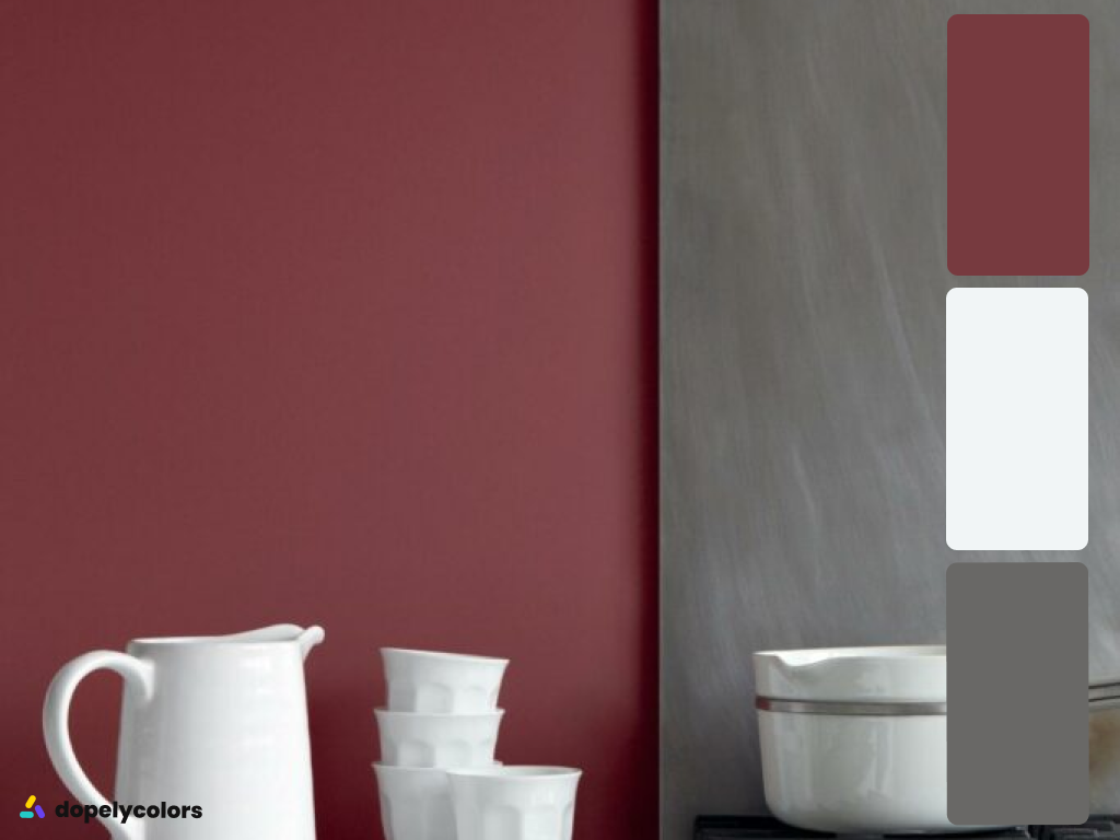
Marsala is Pantone’s color of choice for 2015. The combination of this color is close to red and brown. In addition, it exists in nature and inspires a sense of earth and nature.
Marsala color evokes a complex sense of naturalness and earthy nature. A warm, strong and hearty color has a variety of colors that can be used both as a base color and as a complementary color.
Due to the tragic events that took place in 2014, Pantone chose the color Marsala because it is a sign of strength, confidence, self-confidence, security and comfort. Marsala warm color can be a good choice for years of friendship and coexistence.

Pantone color of the year 2016:

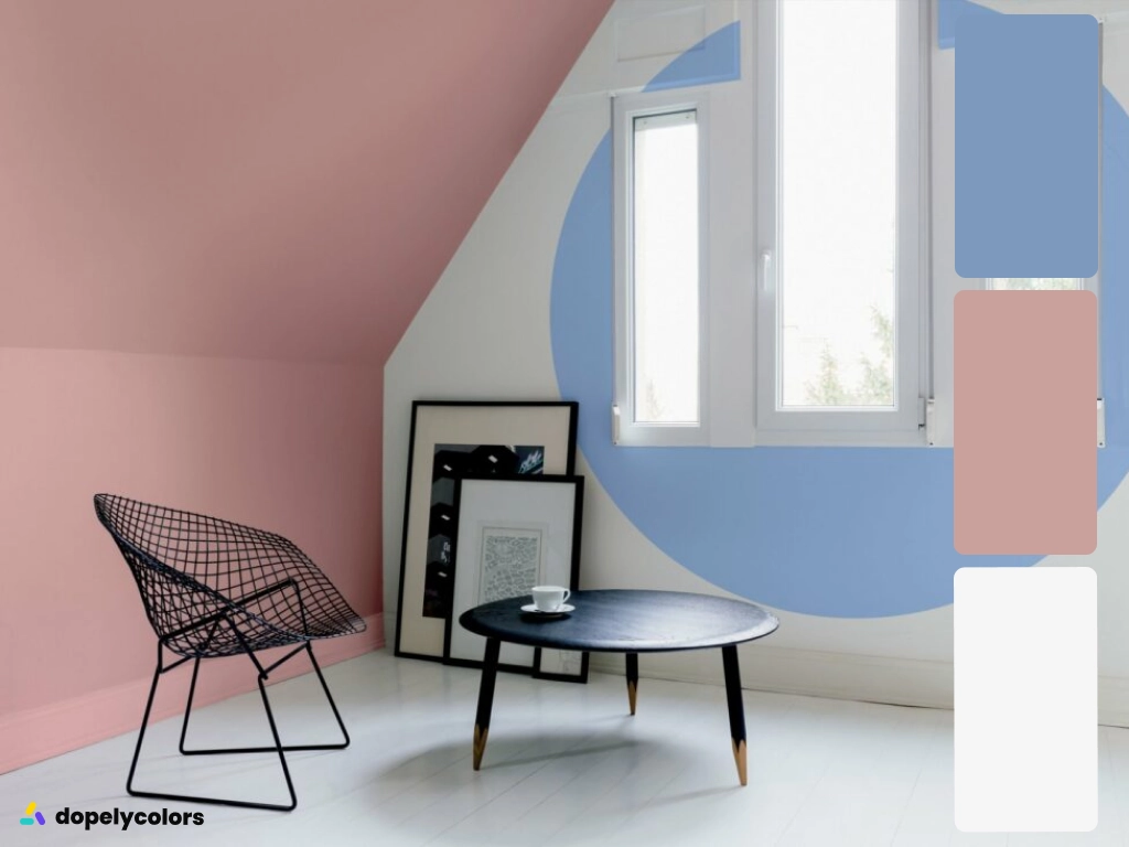
For the first time, Pantone chose two colors as the color of the year. Rose Quartz and Serenity are the colors of choice for 2016.
These two colors create a special feeling of cheerfulness, coolness and calm in the audience. These colors also inspire a desire for confidence and security. Rose Quartz is a soft color that conveys compassion and a feeling of coolness to you, and Serenity is like the blue sky above us, full of a sense of calm.
These two colors have always been the difference between the sexes in different nations. The reason for choosing these two colors together is to encourage society to move towards gender equality.

Pantone color of the year 2017:

The color chosen by Pantone for 2017 is Greenery. Which is yellowish green.
This color is the color of nature, the color of fresh and young buds. Besides, this color is a symbol of rebirth and renewal. Greenery also conveys a sense of well-being.
Looking at this color reduces tension and stress. It also pays more attention to reconstruction and rebirth. The reason for choosing this color is to refresh and give life to nature and the environment.


Pantone color of the year 2018:

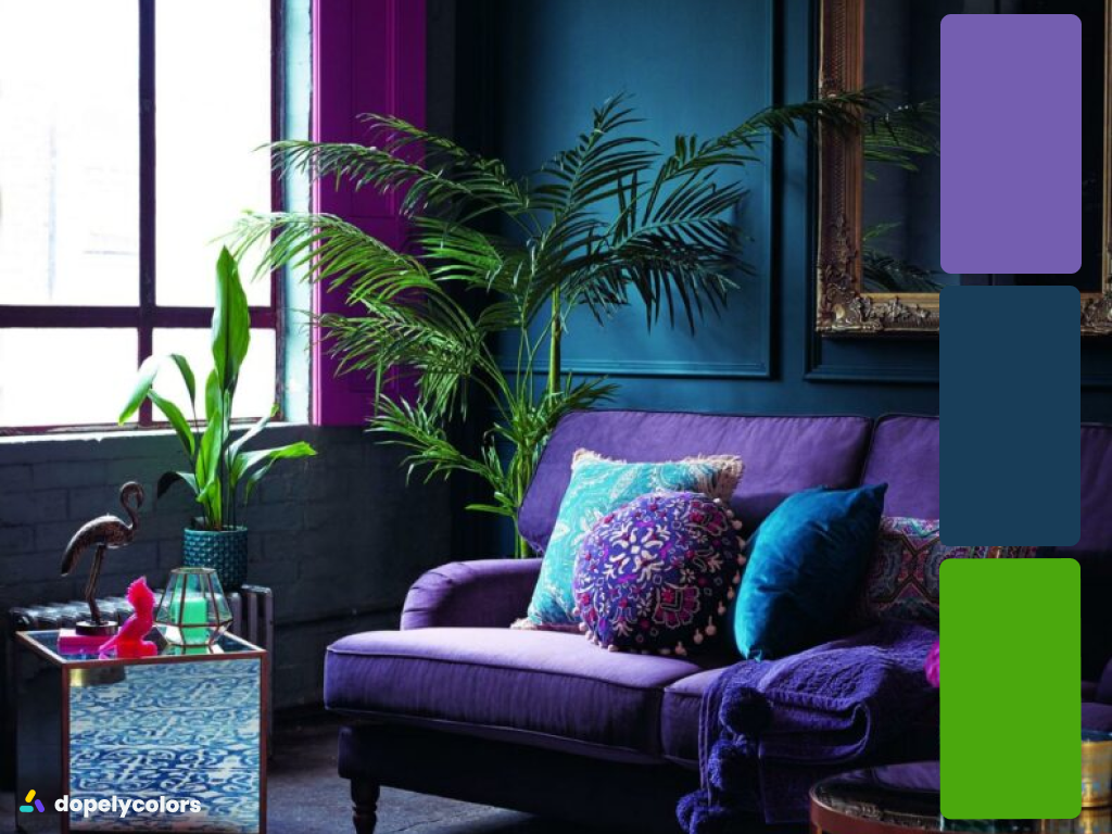
This time Pantone chose the color Ultra Violet. This color is obtained from a combination of blue and pink.
The color of 2018 is a symbol of sobriety and peace. In addition, it is a happy color and is able to make your environment attractive, artistic and creative.
The reason for choosing this color is the originality, genius, thinking and insight that it shows us and leads us to the future.
Pantone color of the year 2019:

The attractive color of 2016 is Living Coral. This color is one of the vivid spectra of orange that has a golden undertone.
This color, taken from the coral reefs of the underwater world in the seas and oceans, reflects heat. Also, it is a symbol of happiness and optimism.
The reason for choosing this particular color is to pay more attention to natural resources and underwater life. Because coral reefs are a significant part of the marine life ecosystem, they are also important in preserving marine life for other organisms.


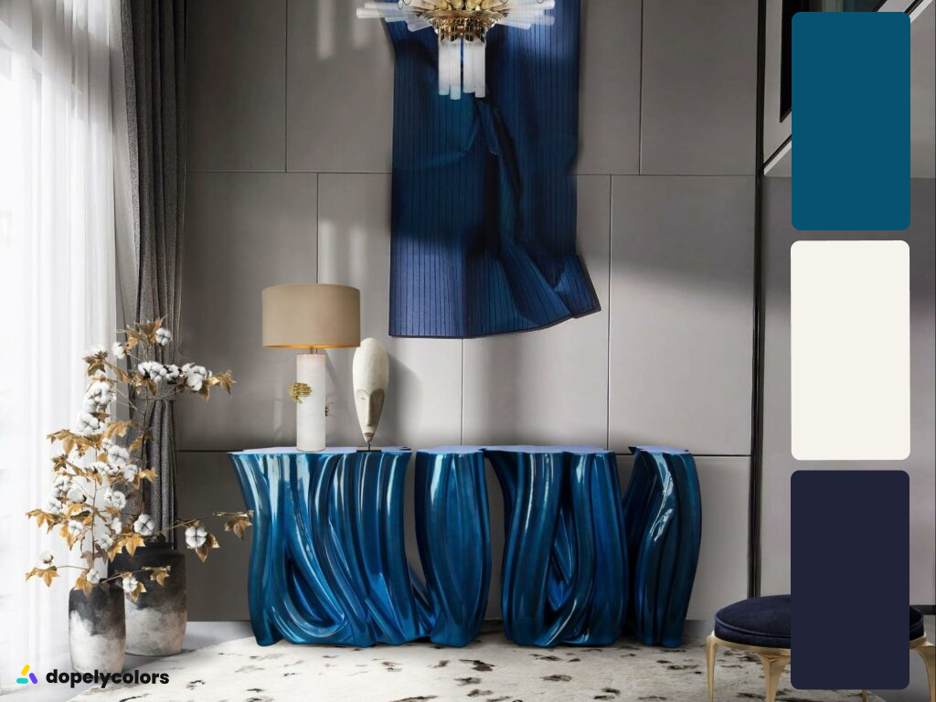
Pantone color of the year 2020:

The stylish color of 2020 is Classic Blue. This color is blue close to navy blue.
This color, which is taken from the depths of the oceans and the sky, creates calm, increases confidence and communication.
For years, environmental threats have threatened the seas and oceans. This is the reason for choosing this color.

Pantone color of the year 2021:

Finally, the color of 2021, like 2016, includes two colors, Illuminating and Ultimate Gray.
Illuminating color belongs to the yellow color family, so it is a cheerful and vibrant color. Symbol of resurrection from the ashes. Ultimate Gray, which belongs to the gray and neutral family, is the color of stillness and depression. Of course, in decoration design, it is a symbol of peace.
The corona virus, which last year changed all human relations, economics and politics in the world and led to homosexuality and home quarantine, seemed to turn the world gray, but with the discovery of the corona vaccine, there was a glimmer of hope. In fact, going from gray to yellow is going from depression to light. And the reason for choosing these two colors is the promise of a world free of corona and a return to the old days.
Pantone color of the year 2022:

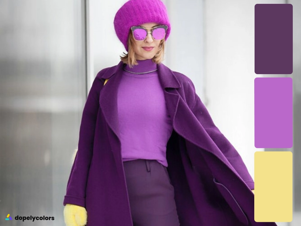
The beautiful color that Pantone has chosen for 2022 is very peri.
Very Peri color reflects the global culture these days. In addition, this color creates a way to express ideas and influence people’s feelings. Also, it makes it easy for people to communicate with each other.
Actually, this color is a combination of blue, red and purple. So, this color shows the characteristics of blue colors and the combination of this blue color with purple, and red has turned it into a happy and energetic color, the use of which provides a dynamic and joyful presence. It is also a bold creative color that encourages imaginative expression.


Conclusion:
Every year, many designers and industries wait for Pantone to announce the color of the year so that they can produce designs and products with the color of the year 12 months later.
Each year, Pantone chooses colors based on last year’s events and with a humanitarian message.
Above all, paying attention to the message that each color brings with it makes us pay more attention to our surroundings.
You can also read complete information about each color in Dopely’s Color Pedia section!
What is your favorite color?