Imagine yourself holding a Starbucks coffee in McDonald’s line to grab your hamburger! What do you think made these two brands popular? Product quality? Packing? How do branch customers treat you? Their price? It’s all about the logo.
Have you ever paid attention to the logo of these brands? Did you pay attention to the colors that are specific to each logo? The color of the logo is closely related to the final product of that brand and has a great impact on its visibility!
In the following, I am going to explain the psychology of most colors in your brand logo.
Let’s see how this works?!
Psychology of logo colors!
Colors are able to convey meaning. The human mind responds more quickly to visual stimuli. As a result, it can react quickly and appropriately to colors, thereby understanding the meaning of each color.
Graphic designers take this into account when creating a logo, so that companies that have an important message to convey to others can emphasize this message through their logo. So you, as a logo designer or even a brand owner, need to have a broad understanding of color psychology.
Every color, even black and white, conveys a specific meaning, knowing these meanings will help you make the right choice in choosing the color of the logos.
Bright colors are usually more noticeable to the eye, but overuse can also irritate the eye and make you look hurried. Dark colors convey complex messages, but overuse can be ignored. So the correct use of each color is also important.
Let’s look at the colors!

Colors are generally divided into three categories:
Cool colors:
The range of colors from purple to green is cool colors. Seeing these colors lowers blood pressure, heart rate and respiration rate, and induces a feeling of calm, coolness, satisfaction, and sometimes coldness.

Warm colors:
The yellow to red color spectrum is called warm colors. These colors intensify emotions and stimulate the nervous system of the brain. They cause a feeling of love and excitement and sometimes anger and rage.

Neutral colors:
Colors such as white, black, gray, and their spectrum are called neutral colors. These colors, as their name suggests, are neutral and soft.

Popular logo colors!
1. Purplecolor in logos:

Purple is a royal, stylish, special and unique color, especially dark purple, which is a symbol of wealth. It is a symbol of decency, dignity, power, glory, ambition, mysticism and spirituality, and sometimes a symbol of isolation, pride and arrogance, coldness and sorrow.
This color signifies wisdom, knowledge and dignity and refers to being feminine and it is also mostly used in the logo of finance, health and technology. This color is used for beauty and anti-aging products because it conveys the feeling of vitality and youthful flourishing. It is better to use purple for luxury packaging.
The Syfy network has a purple logo that is suitable for the theme of this network which has incredible glory.

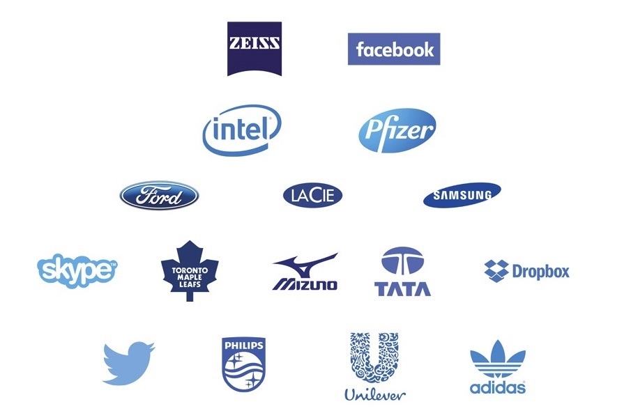
2. Blue color in logos:

Blue is one of the most popular colors for logo design. The reason for this popularity is because of the sense of calm, security, confidence, self-confidence, intelligence, loyalty, power. Blue, symbol of water, sky and sea, success, Authority is a friendly, professional and happy feeling, but sometimes it is a sign of despair and depression, coldness, maturity and dependence.
Due to the reduction of heart rate and respiration rate, the person feels calm and relaxed. Due to the long wavelengths that are blue, it can be seen from a great distance. That’s why most airport landing lights are blue. Different spectrums of blue can convey different emotions. Crimson, for example, attracts buyers who want to save money, as well as for corporate and corporate logos. But Royal Blue attracts buyers who care about time, as well as cleaning products.
Blue is very popular with government agencies and national organizations for instilling a sense of professionalism and authority. Blue is very popular with energy, aviation and technology companies, financial institutions, government agencies for instilling a sense of professionalism and authority, conveying the concept of robust and uninformed function. This color is less common in the clothing and food industries.
The HP brand was first for printers, but it actually belongs to an IT company that makes all kinds of TVs, laptops, scanners and tablets.

3. Green color in logos:

Green is a combination of yellow and blue, so it brings the feeling of these two colors. This color inspires spring, freshness, nature and growth. It is also a symbol of money and wealth. Green is a masculine color. It is a symbol of peace, health, freshness, purity, security, hope, environment, recycling, harmony, youth, abundance of blessings and good fortune, but sometimes it is a symbol of conservatism and jealousy.
This color gives man a feeling of hope, peace, tranquility and rebirth. The use of this color is more suitable for the background color of logos because of its calming effect on the eyes. Green is suitable for brands related to the environment, organic and food products, plant products, finance and technology.
The Subway brand belongs to a chain of restaurants that produce healthy and organic food products. This is why they have used green color in the logo to emphasize the health of their products.

4. Yellow color in logos:

Yellow symbolizes the sun, energy, warmth, radiance, clarity, youth, happiness, creativity and development. This color should be used in moderation and caution, because sometimes it induces feelings of fear, restlessness and insecurity.
This bright color stimulates the appetite, so it is suitable for use in food logos. This color is also used for warning and warning signs. This color enhances creativity and concentration, so it is suitable for products that are related to children and adolescents.
Because the yellow color makes you feel comfortable and cheap, so it is suitable for the logo of stores that have the slogan of being cheap. It also conveys the concept of clean and powerful energy, so it can be used for company and energy related logos. Yellow attracts attention. For this reason, most taxis and school buses are yellow.
The famous brand Pringles, which produces appetizing foods, has a yellow logo.

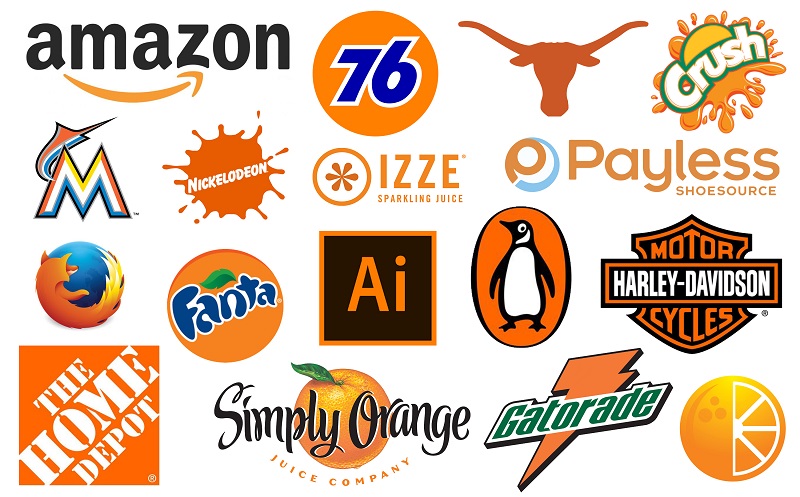
5. Orange color in logos:

Orange is a symbol of sunset, fire, warmth, a sign of autumn, creativity, joy, mobility and activity, confidence, courage and optimism. But sometimes it conveys a feeling of mistrust and deception.
It stimulates nausea and increases appetite, so it is used in food logos. This color strengthens sexual power, memory, mental activity. Boosts the immune system. Increases oxygen to the brain.
It boosts self-confidence, adventure and passion, so it takes action. It is also suitable for sports topics because it conveys a sense of energy. This color is a sense of youth, passion, social connections and interactions, friendship and love. Orange is widely used in graphic and logo design.
Fanta brand whose products are colored drinks. It has an orange logo that indicates a fruity, fun and fresh theme.

6. Red color in logos:

In addition, most children who do not have the ability to recognize the contents of the packaging, when they enter a store, This color is the color of love and affection, passion, lust and adventure, the original color for roses.
Red symbolizes energy, dignity, greatness and power. It is also a sign of stopping, danger or urgency, fire, blood and war. But sometimes overuse can cause fatigue, anxiety, boredom, violence and anger. This color stimulates the appetite, so it is very suitable for use in food logos.
This color attracts attention, releases adrenaline in the blood, increases human desire and enthusiasm in all areas, increases motivation, enthusiasm to do things, makes people accelerate to convey a sense of excitement, increases blood pressure, respiratory rate and heart rate. It becomes the heart, it is energizing and makes human beings move and function.
Red is very popular with men. If you want to have an attractive logo that attracts attention, red is a good option. Subconsciously absorb the products with red packaging.
McDonald’s brand, which is famous in the food industry and is mostly famous for its delicious food, has a red logo that stimulates the appetite.

7. Pink color in logos:

Pink, unlike red, is one of the calmest colors. It symbolizes pure love, a love story and conveys a feeling of softness, peace and comfort, dignity, coolness, immobility and stillness and imagination. This color reduces aggression, anger and rage.
This color is a good option for buyers who are interested in traditional style to choose a logo. It is also very suitable for products for women and girls.
Pepto-bismol tablets are tablets for indigestion, which have a pink logo.

8. White color in logos:

White is one of the neutral colors and means there is no color, so it is better to consider it as a secondary color in the logo. This color symbolizes light, brightness, purity, purity, serenity, innocence, ceasefire, unity, balance, peace and perfection. But sometimes overuse can lead to boredom.
White is a sign of perfection, youth and affordability, so it can be used for any brand. But this color reduces appetite, so it is not suitable for food products. In logo design, the use of this color makes your design clean, orderly and simple. It is usually very convenient to use in the background of the logo. Because it makes the main logo visible. Finally, white is used for product logos that are fully functional, affordable, and clean.
The music television network has a black and white logo. Most logos have a white background.

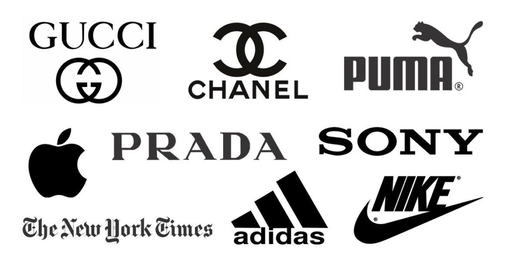
9. Black color in logos:

Black is also in the category of neutral colors. It symbolizes wealth, power, seriousness, intelligence, mystery, evil, depression, mourning and death. Although this color is associated with negative signs, psychologically for choosing the color of the logo, it is a delicate, simple and complete color, and it is a sign of professionalism and seriousness of the brand and is one of the most prestigious organizational colors.
They usually design a black and white version for each logo. Because one of the attractive colors to complement black is white. Because this color builds confidence, if you want to have a logo that gives your brand a sense of power, obedience and command, this color is great.
The adidas brand, which is a popular brand of sportswear and ketones, has a black logo.

10. Gray color in logos:

The combination of black and white creates a gray color that is neutral. Symbols of balance, composure, intellect, compromise, neutrality, independence, formality, independence. But sometimes it is a sign of despair, depression, fatigue, death, grief and poor quality.
It affects and balances the colors around it and conveys different meanings depending on whether it is darker or lighter. The darker it is, the more mysterious it is, and the lighter it is, the more stable it is. Because of its delicacy, it can be used both to show strength and to show weakness. This color is a serious and classic color and conveys a sense of independence and indifference, neutrality, independence and stagnation.
Because of the negative emotions it conveys, it is not appropriate to use it alone in the logo, unless it is in the background or in combination with other colors. Can be used for companies’ logos related to technology, fashion and modern and luxury products.
The Swarovski brand, which is a brand for watches, has a gray logo to show the seriousness and classicism of their products.

11. Brown color in logos:

This color is a symbol of soil and earth. It is a sign of friendship, nature, warmth, seriousness, masculinity, trust and security, balance, conservatism, experience and credibility. But sometimes it is a sign of boredom and pollution, sadness and heaviness and roughness.
Orange-brown color stimulates the appetite. And suitable for food products. It is a masculine color. Using it wisely in the logo can have amazing results. Suitable for logos of brands related to construction, rural life, nature, wood, leather, animals, agriculture, coffee, healthy nutrition and organic products.
The popular Louis Vuitton brand for fashion, bags, shoes, and accessories has a brown brand and is very popular.

Do you want to know more about the relationship between the colors of each brand? Visit Brand Palettes Explore!
Use of colors in the logo:
Although the original logo is simple, there are successful logos like Google and Windows that come from a combination of several colors. And yet they have the same simplicity and originality. Multi-colored logos usually offer a wider range of different products and services.

Conclusion
You have to keep in mind that colors have different meanings in each culture and country. The same goes for the intensity of the darkness and the brightness of the colors. So when designing a logo, pay attention to these meanings and consider them appropriate to your brand products.
You need to pay attention to the message you want to convey to others through your brand and choose a color for your logo that is as close as possible to your message. If you own a brand, what color do you choose for your logo?
Share your thoughts with me and people like me who love colors!


Hey Nazanin,
Thanks for explaining the psychology of colors. Colors are essential considerations when making a logo as they evoke brand association and trigger emotion and are integral part of branding.