Look who’s back!! Yes, it’s me again. Today, I’m here to talk about the use of colors in the design system. Oh no, I’m not a design system expert (at all -__-). I just happen to know a lot about colors (thanks to my internship). Ok then, let’s start We know what color is. But what about the design system??
What Is A Design System?
It’s the source that enables the teams to design, realize, and even promote a product or service. So, the design system should be as developed as the product.

Each design system has some foundations like the color, icons, layout, and typography. Now it’s time to see what colors do in a design system? How do they change a design system? How should you pick a color or a set of colors for your design system? Why do I need to bring colors in my designs?? Because it’s dull and drowsy and soulless without colors (sorry it was a bit harsh but it was the truth).
Colors In The Design System
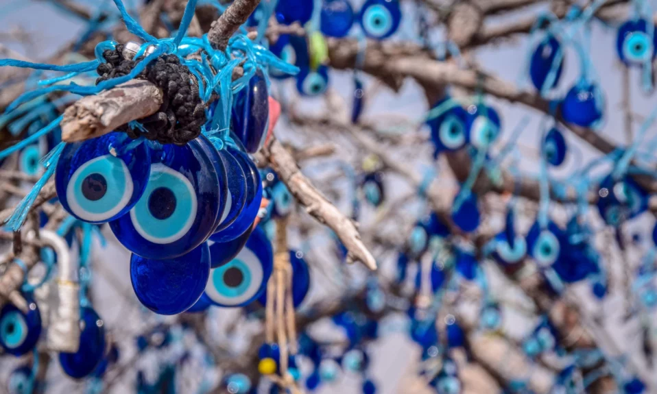
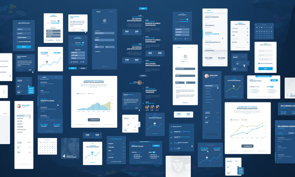
Using colors for your web design is an absorbing way to present your service. Colors can stick to visual memory and are easier to remember than texts. Your UI result can hugely depend on the color palette you pick for your design system; so, take as much time and energy it needs to find the best. When you’re selecting colors, you need to ensure that the chosen colors will create accessible contrast. The proper contrast ratio helps the users to read and use options and icons more easily (you can use contrast checker tools). Colors can show what elements are more interactive. So, they can indicate the level of superiority of each option (bold the more important parts).
Primary Palette
Primary colors are the ones that are used most frequently across your website or app ( or your brand). These are, somehow, the base of other sections. In other words, primary colors can be your representative. Choose your representative carefully. Primary colors are better to be chosen early; because you can pick other options based on them. Use dark and light variants of the primary colors to create contrast between the UI elements, such as toolbars, icons or buttons, and links. There are primary versions for each color; primary blue, primary red, primary orange, etc. So, you can pick primary colors for your core designs and go with different tints and shades for other items.


You can get inspired by nature and pick colors from natural events like sunrise and nightfall. You won’t regret it.

Secondary Palette
This group complements the primary colors. By using some secondary colors in your modeling, you can signalize your UI elements and be more pleasant. But, when I say more colors, I don’t mean 20 -__-

Extended Palettes
Once you’ve taken care of all other colors ( primary, secondary,…), it’s time to have some additional shades and colors to develop your UI. This part is up to you or the design team ( yeah, like other parts were up to my late grandma). Dude, this is your design, you choose; I’m just giving some ( hopefully useful ) info.

Interactive Digital Blue
This is one of the most common colors for links and clickable buttons and icons. But, if your brand has blue color too, don’t make it the same blue (don’t use the same colors for both your brand and your design). You can bundle more accessible colors in each hue, and use each stack of colors as a visualized tool to show the details.


Neutral Colors In The Design System
One of the most significant things about the design system is the contrast ratio of the colors. Then, you need a color for the background. Gray as a neutral can come in handy for the background. It’s better if you avoid using medium shades of gray in between (it may not produce proper contrast). Neutrals are used in the largest part of your UI (the base of the design).


Semantic Colors
You can use different colors to express concepts. These colors transfer the message and purpose to your users. For example, red for error, green for confirmation or success, blue for clicking and links. Colors have a various range of tints and shades, and therefore; you need to be very careful what you choose to get you the best possible result. You use colors to represent your brand. To do that properly, you’ll need to know about primary colors, secondary colors, and dark and light variants.


Color Naming
You need to name the colors used in your design. How do you do that? Well, there are many ways to do this. You can pick preliminary names based on a scale from 0 to 10. For example, #blue-03, or #green-08 Another way is to use the hardcoded value codes like #1CDF7E (do you know what color this is?!). Well, it’s a negative point about this method; that not everybody knows these codes (I mean, does anybody know them at all??). There are different types of color codes, like HEX, RGB, HSL, CMYK, and HWB. Each of these gives a distinct piece of info about a color.

Don’t Use Limitless Shades Of Colors For Your System
The more options the harder the choice. You don’t want to get confused by an endless variety of colors. But some well-matched and useful combinations of colors that give you an easy access to pick the right one.
I need to build a color system. What do I do?
- Organize your system colors
- Create extended palettes
- Choose name conventions
- Define usage guidelines
- Release for testing
- Release to developers
There are several tools for picking colors. Color palettes, color converters, and contrast checkers, which can help you decide what’s best. I’ll mention some of the most useful tools in the following. After establishing your color palettes, you need to check for accessibility. That is to make sure the contrast between text color and the background color is sufficient and it’s easy to read the text on the background. Then, it’s time to check for the final edits and whatever that needs to be improved (layouts, contents, landing and other pages, elements, UI, UX)
Last task
The last part is to be released and be tested to get the real interaction with your audience (when real users are using your website and you find what’s working perfectly and what’s not).
What to use?
Now that you have the basic information about the design system, you need some color tools to apply this info. Dopely provides you with practical tools to put your ideas into action. On our website, you can have whatever you need to work with colors, like color palette, color converter, contrast checker, and color wheel.
Hope you like this article and find it useful for your designs.