What is Color Psychology

Color and food have a strong relationship due to color psychology. The psychology of color is based on the mental and emotional effects of colors on sighted people in all aspects of their lives. Color psychology includes some subjective elements as well as some more accepted and proven ones.
Emotions and colors go hand-in-hand. Cool colors can evoke different feelings than warm colors, and bright colors can create different emotions than muted colors. It all depends on how color uses psychologically.
Colors affect our emotions, such as happiness and sadness, hunger, and relaxation. Psychology, biological conditioning, and cultural imprinting all play a part in these reactions. If you are interested in color psychology and color preference, you can also read this article.
Color psychology teaches us where and how to use each color to show its effect properly. In this article, I want you to be my company in learning more about the relationship between colors and food.
Color and emotions
A color’s ability to influence an emotion depends largely on its brightness, shade, tint, or tone, as well as whether it is cool or warm-toned. Colors have many effects on how you feel. Let’s see how:
- Warm colors
The warm colors red, orange, and yellow are next to each other on the wheel. Warm colors are often associated with happiness, optimism, and energy. Although yellow, red, and orange can signal danger and encourage you to take action. Moreover, red can also make a person feel hungry.
- Cool colors
Green, blue, and purple are cool colors. Generally, these colors are calming, but are also able to express sadness. Purple often uses to spark creativity because it combines blue and red (calm and intense). If a business wants to represent health, beauty, or security, it should use these colors.
Color and food

Since colors can evoke different emotions, they also play an important role in increasing or decreasing our appetite. Some colors make us want to eat, while others keep us from eating. So we can even control our weight by using different colors in our daily diet.
Color and food: Choosing colors for food
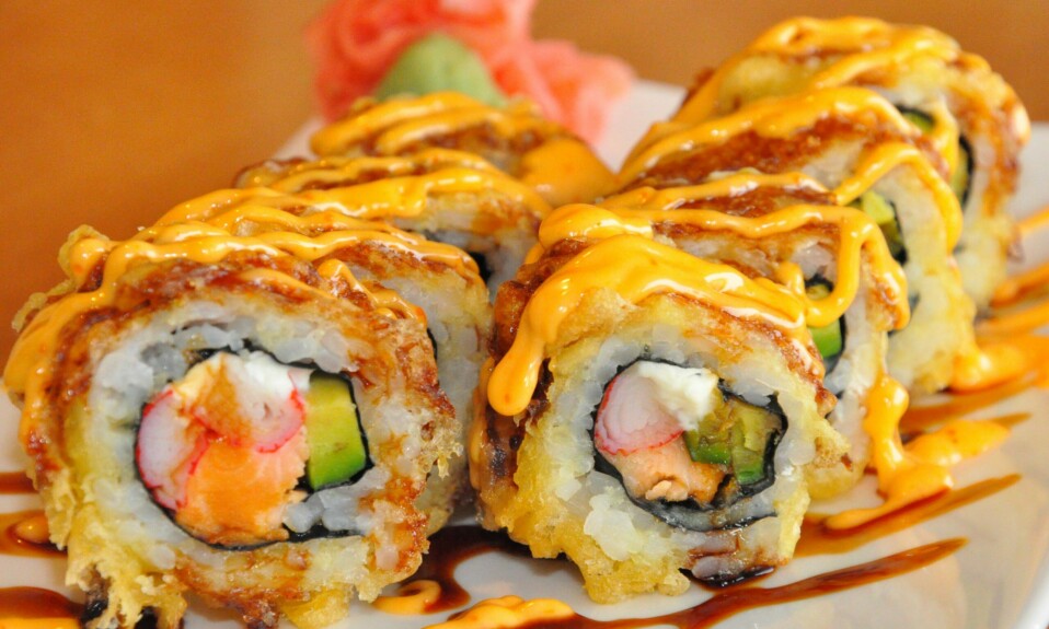
Color influences how we choose our food. The first thing that we notice when viewing the appearance of a food product is its color. Researches show that visual taste perception is developed in infancy and increases with age. As an example, if something is bright red we may expect it to taste like cherry or cinnamon. The color green might suggest that something tastes like lime or apple. Fresh foods, such as fruits and vegetables, are also judged based on color. Now let’s see how each color of food talks to us!
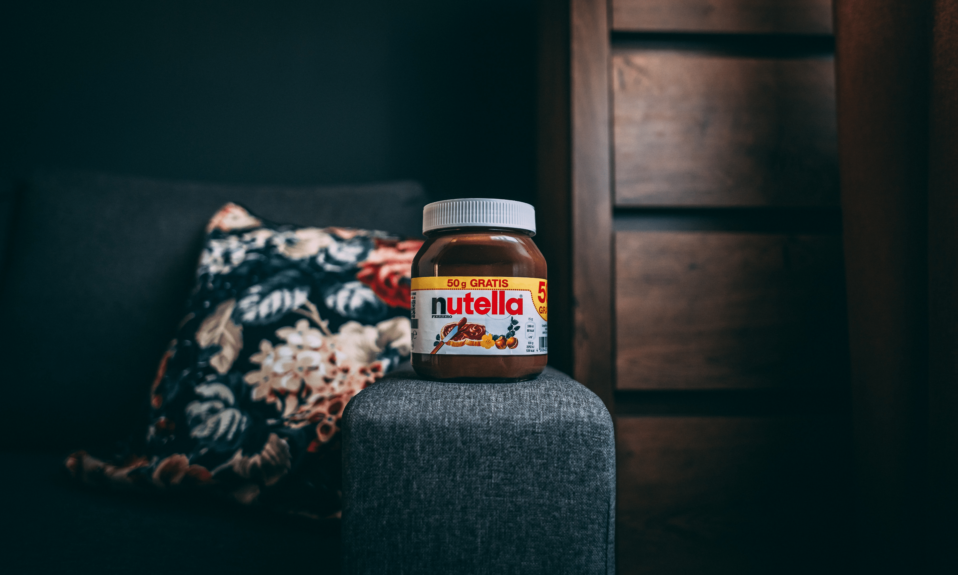
Red: Appetizing
Researchers have found that red is eye-catching and increases appetite. This effect is advantageous to packaging design since it indicates ripeness and sweetness when seen in foods such as berries.
Blue: Instagram-able
The color blue is believed to decrease appetite. This color reminiscent of blue skies and oceans is said to soothe the body and slow metabolism, thus curbing one’s appetite. While the cause of blue foods is not known, some research suggests they may suppress appetite.
Yellow: Happiness
Yellow is considered the happiest color and is widely used in food products. Therefore, yellow tends to inspire optimism and overall good feelings. Although there are various speculations and disagreements regarding yellow artificial colors in food products.
Green: Natural/Healthy
Green has become one of the most popular colors in the food supply chain, with sustainability and organic being on the minds of many consumers (think of green juice). Today, green is considered a color of well-being and health when it comes to food.
Orange: Satisfying/Energizing
In western cultures, orange foods often symbolize autumn, such as pumpkin products, squash, and candy corn. Throughout the year, orange juice and carrots are linked with vitality.
White: Cleanness
The color white is associated with purity and innocence and is believed to cause the brain to ignore its cares, causing overeating and mindless snacking.
Brown, Gray and Black:
These colors reduce appetite. Gray and black food items may conjure up images of mold and decay, while brown represents overdone or burnt goods.

Color and food: Choosing colors for packaging
As we said, color is something we notice first. Over 90% of purchase decisions are influenced by visual factors, and 85% of shoppers say color is an important factor when purchasing a product. The color of the packaging influences a consumer’s purchasing behavior. So food manufacturers should attempt to understand this. While the colors described above represent how we feel about food, the colors on the packaging represent an entirely different reaction. Here is an overview of how some colors look in packaging. Let’s see.
Red: Energy
Red packaging is bold and draws attention to your product. Food packaging with red accents is not only known to increase appetite, but it also caught people’s attention first. This is why red is so prevalent in food packaging.
Blue: Trust
Using blue packaging conveys trust and reliability. However, Darker blues are more formal, whereas lighter blues evoke a feeling of softness and creativity.
Yellow: Optimistic
In packaging, yellow indicates originality, innovation, or a product that is less expensive or fun. Because of this color’s positive energy, it can help attract a younger demographic.
Green: Healthy
Green packaging, like food coloring, is associated with healthy and organic products. In recent years, green has become more popular as health-conscious consumers pay attention to what they eat.
Purple: Uniqueness
Use of purple in packaging signals that your product is original, spiritual, and unique. Purple is commonly used in holistic products.
Orange: Affordability
For food marketers, orange on packaging can create an impression of affordability and value. Using orange on product packaging encourages consumers to purchase the product.
Black: Luxury
The color black typically represents luxury and appears more substantial and expensive, which in turn gives the perception of higher value. Often, this color appears on expensive products such as ice creams and chip packages. Black can convey many different messages, depending on what colors you pair it with.
Brown: Earthy
The brown color is appropriate for products that have a natural, wholesome, or organic feel, plus comfort and simplicity. A brand can promote sustainability with brown packaging and when they have a message to deliver, they use recyclable material for the packaging.
White: Simple
White conveys the impression of cleanliness, simplicity, and efficiency. And if additional colors are chosen to complement white, packaging can be elevated or kept straightforward.
Conclusion
The color of a food can significantly influence how much you like or dislike it. Simply looking at food will cause all sorts of reactions in your body. Hypothalamus neurons, located in the part of the brain that regulates appetite, start firing up. As soon as you see food, saliva glands in your mouth begin producing more saliva. Possibly you have done a color analysis to determine which colors suit you best. But from now on, you should think about how colors affect the way we feel about the food we eat. Remember that we don’t eat just by mouth, we eat also by eyes!