


Have you heard of color vibration? Colors are a kind of living energy. This energy is from light, which creates different colors at different wavelengths after being absorbed and reflected. Each energy has its own vibration, so it can be said that each color also has its own vibration.
So, color vibration is a subject that unconsciously affects us and our decisions. Imagine the time when you choose the color of your daily clothes according to your mood. On the other hand, color vibrance in some cases creates problems related to contrast and issues for users with vision problems.
I am here today to learn more about color vibration and related topics. Do you want to come on this short trip with me?
What is color vibration?
In web design, using a light color alone does not create a particular problem in the background and does not make it annoying to look at. But this does not apply to the use of two bright colors. The use of two bright colors causes interference in the background images and creates a kind of visual vibration.
In fact, the event in which the edges of two almost identical bright, bold or highly saturated colors are placed exactly next to each other so as to create the illusion of movement, are called vibrating colors. Such colors are aggressive and often annoying. However, the resulting vibration can be reduced by placing a darker, pastel or neutral color between the two chosen colors.


Vibration color; good or galling?
I said earlier that vibrating colors can be used in two ways: useful and annoying.
Although the use of vibrant and glamorous colors is allowed in the printing industry to some extent, many web and interface designers imitate this and use vibrant colors in some cases. This use can have good or bad results for users.
The negative side of using color vibration
In the user interface and web pages, it is necessary to use a combination of colors that attract the user’s attention. There is also a need for color schemes that increase the readability of the text. When vibrant colors are used for the text and its background, it will make the readability difficult.
Because, the edge between two colors that are in the category of vibrating colors, gets distorted and the user’s concentration is lost and his eyes get irritated after a few seconds. That is why the existence of vibrating colors in the context of texts and small symbols is very dangerous.
In addition to the use of vibrant colors for people who do not have color vision problems, it will cause problems for people with color vision problems, such as color blindness. Cause the use of colors with the same brightness causes different color blind people to not see anything in the end.
Indeed, it is best to choose colors in such a way that everyone with all different levels of color blindness can see them. For example, the color of the trash can in Apple Watches has been chosen in such a way that color-blind people cannot see it.

The positive side of using color vibration
In limited cases, it is necessary to use vibrant colors to direct users’ eyes to a specific point and draw their attention to a point. In this way, on web pages, you can sometimes choose the color of a specific section, such as a button in the background of the web page, from vibrating colors. In this way, the user’s attention will be drawn to that part. Besides, you can see the effect of vibrating colors on health and mood.
If you want the contrast between the text and the background on your web not to be annoying and not among the vibrating colors, you can use this tool of Dopely!
We make unconscious choices of colors every day that affect our mental and physical state. Like when we are in a bad mood, but we can restore the lost energy by wearing orange or yellow clothes. Or when we are going to give a speech or an action that is associated with stress, wearing blue clothes will help us.
Finally, all these choices affect the color aura around each of us and our emotional states. Shortely, it can be said that colors are a means of communication between us and the surrounding environment. The use of vibrant colors in your cover and surroundings, as opposed to what is in the user interface of web pages, will help to change your mood and improve your health.

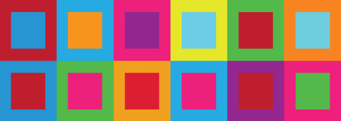
A few vibrant color combinations
In the table below, there are several color vibration combinations that can cause background problems and effects. Although some of these color combinations pass the WCAG contrast test with a good score. But it may make it difficult for users who have color blindness to distinguish colors. And it may hurt the eyes of users who do not have color vision problems.
| Red on Green | Green on Red |
| Blue on Orange | Orange on Blue |
| Green on Magenta | Magenta on Green |
| Yellow on Cyan | Cyan on Yellow |
| Magenta on Blue | Blue on Magenta |
| Yellow on Orange | Orange on Yellow |
| Green on Blue | Blue on Green |
| Purple on Yellow | Yellow on Purple |
Last word
Color vibration can be useful and well used, although they can cause problems in the user interface. Therefore, it is necessary to determine the purpose of choosing them during design and then start using it correctly!