


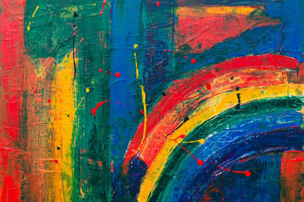
How much do you care about color pairing in your daily life?
Every masterpiece of painting, every great outfit, every exciting interior design, every beautifully captured image and then creation of anything related to color needs a great color palette.
Thus, to create a functional color palette, you need to increase your color pairing ability. To do this, you must first swallow your frog. And master the color wheel !
We further understand, what is the color wheel? What are the rules of that relationship?
Finally, we see some known combination colors.
Let’s go!
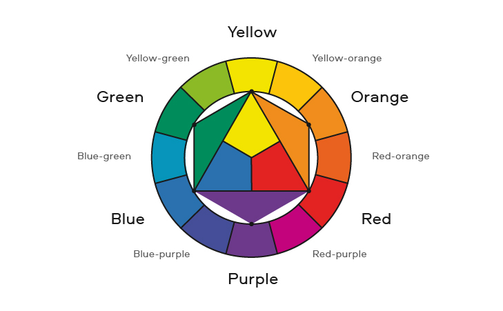
Color wheel
Primary colors:
According to Isaac Newton’s theory, the combination of colors in a circle is the color wheel. This cycle is a combination of the three primary colors, red, yellow, and blue (RYB). Because these three colors are not from the combination of any color, but they can be effective in the combination of colors.


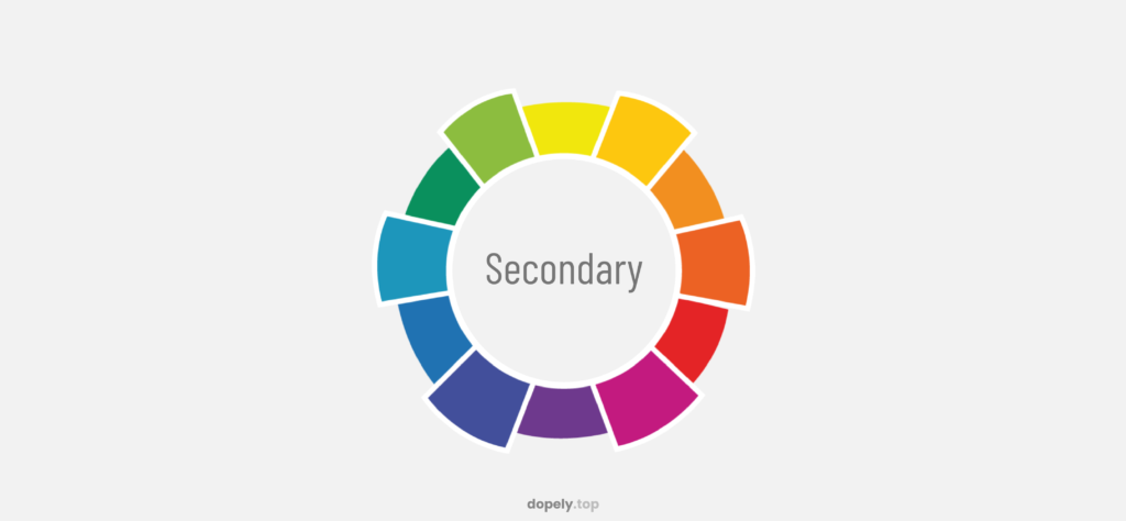
Secondary colors:
By combining each of the primary colors equally, the secondary colors of the cycle are created. As a result, they are purple, green and orange.
Red + Blue = Purple
Blue + Yellow = Green
Red + Yellow = Orange
Tertiary colors:
Therefore, tertiary colors are a combination of primary and secondary colors. Which include 6 colors.
Yellow + Orange = Yellow-Orange
Orange + Red = Orange-Red
Red + Purple = Red-Purple
Purple + Blue = Purple-Blue
Blue + Green = Blue-Green
Green + Yellow = Green-Yellow

Neutral colors:
There are also colors that have no place in the color wheel, which are neutral colors.


Warm and cool colors:
We divide color wheel into warm colors and cool colors:

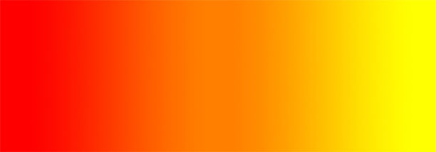
Warm colors convey more emotion and have great excitement and flexibility and contains a range from yellow to red.

But, cool colors are paler than warm colors. They also have calm, peace and contains a range from purple to green.


Several color termes:
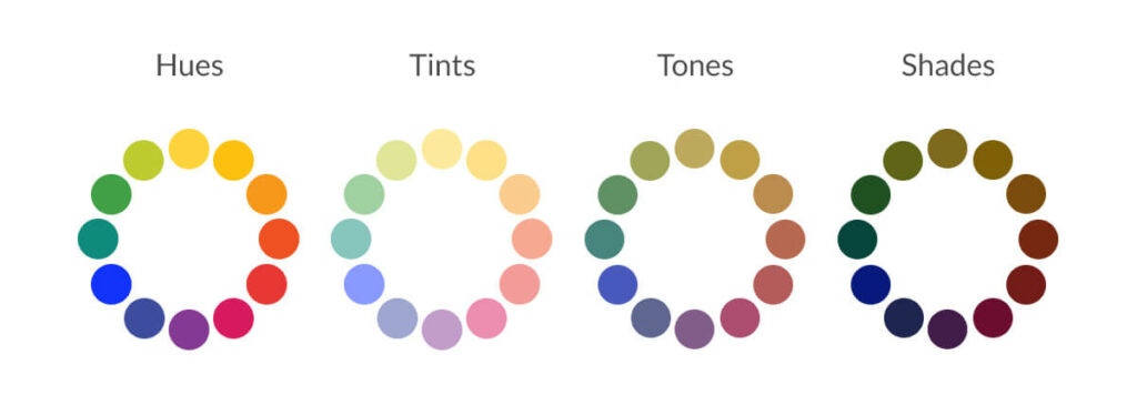
•Hue:
The predominant color name of any color family is hue. For example, blue is a hue. But black, gray and white are not as a hue.
•Shade:
A hue produced by adding black is Shade.
•Tint:
A hue produced by adding white is Tint.
Sometimes it called a pastel.
•Tone:
A hue produced by adding grey is Tone.

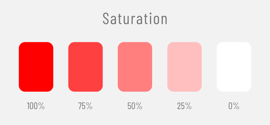
•Saturation:
The intensity or purity of a hue.
•Value:
Specifies the relative degree of darkness and lightness of the hue.

The rules of color relationships
•Complementary colors:
Colors sitting across from each other on the color wheel. Also, the colors in this section include the highest contrast.
•Analogous scheme:
Colors that are next to each other in the color wheel. The color combinations of this section are very common and used.
•Triadic scheme:
In this case, colors that are in the color wheel at the same distance from each other at three points. This color combination also creates contrast, not as much as complementary colors.
•Split-complementary scheme:
In this color scheme, we use one color and two adjacent colors of complementary colors. This composition also has a strong visual contrast.
•Tetradic scheme:
In this color scheme, there are four colors that complement each other in pairs. This color combination is very bold, but because there are more colors, it is more difficult to maintain balance. Accordingly, a dominant color should be chosen from them and the rest of the colors should be around it.
•Square scheme:
Finally, colors that are in the color wheel at the same distance from each other at four points and in this composition, you should pay attention to the harmony of cool and warm colors.


•Monochromatic scheme:
At this point, the combination of three shades, tones and tints of each color is monochromatic. The use of this composition is for various tasks. And creates a delicate color combination.


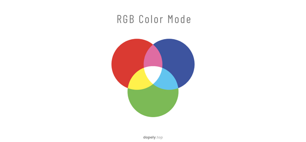
Types of color wheel
The color wheel includes two types of models, incremental and decremental and Both incremental and decremental models are very useful in our daily lives.

The incremental model
The incremental model is as RGB (Red, Green, Blue), which is suitable for light. So, if the visible light spectrum is divided into three parts, it shows the three main colors, red, green and blue.
Combining RGB colors with each other, white is obtained. TV and color monitors use incremental colors (RGB).
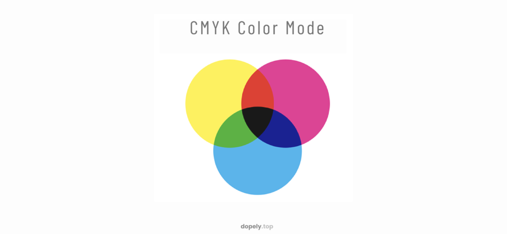
The decremental model
The decremental model is as CMYK (Cyan, Magenta, Yellow, Black). In fact, the modern model is RYB. In the real world, color is declining, due to the reflection of white light and the reduction of wavelength.
From the primary color combination in RGB; Yellow, Magenta and Cyan colors appear in CMYK. Combining all three of these colors together produces black.
The colors that painters and graphic artists recognize as the primary colors are decremental colors (CMYK). Also, It’s used in print colors and ink-based works.
40 color pairing to inspire you!
I tried to bring some types of color palettes additionally to inspire you in each field. These palettes are used in fashion, design, architecture, photography, painting and so on.
Let’s see!


Mandy is a youthful and modern color and belongs to the category of warm colors. So by using this color saturation, you will get different shades of it. Putting them together with dark color, Outer Space, creates contrast.

Usually, the presence of a warm color from the red family, next to a neutral color in the black family, indicates evil. But here, because of Indigo, this issue is neutralized. Because this color is soothing and peaceful.
Also the presence of Indigo next to these colors makes it dynamic and can be used as a background for two other colors. These colors together create a lot of contrast.

In the following, Blue Chill color brings a lot of calm and creates a lot of excitement along with Cello, Waterloo color can be used around these two colors.

These are also the colors of an attractive tropical palette. These youthful and beautiful colors inspire simplicity. All three colors are shades of their dominant color tints.

Putting Froly color next to the other two colors conveys a feeling of calm. Besides, this color combination is very versatile and attractive to everyone. we can use Mischka as a background.
Color pairing is an ability!

This is my favorite color palette. Existence of two complementary colors Persian Pink and Fountain Blue brings a beautiful contrast. Bunting neutral color can be used as a background. All of these colors are tones of their dominant color.

This color palette, whose color combination is done by Analogous, are tints of their main colors, so, these colors together create a lot of energy. Buddha Gold can be chosen as the background copper.
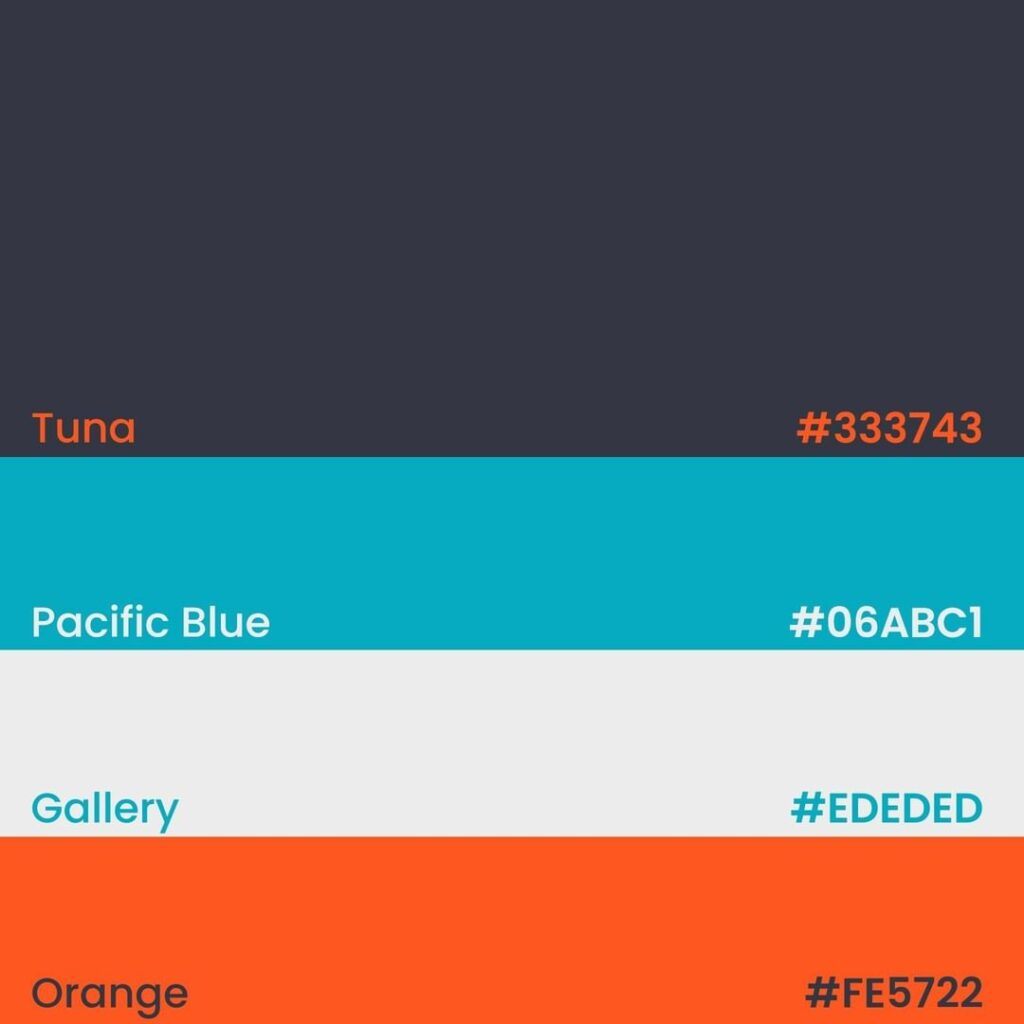
The presence of two neutral colors, Tuna and Gallery, along with two warm and cold colors, leads to charm and calm.

This color palette is created by changing the value of the original color. And conveys a sense of freshness to the audience.

Another color palette obtained by changing the value of the original color is this palette. It conveys a feeling of calm and coolness of the sea to the audience.
Color pairing is used everywhere!

These gentle tints create an attractive color palette that is conservative. This pellet is the best option for use in children’s furniture and design of children’s rooms and clothes.


Due to the presence of Old Lace, there is not much contrast between these palette colors. This palette is also one of the suitable color combinations for the tropics.

This color combination shows the effect of summer, is invigorating and boosts your energy, the colors are also placed together by Analogous.

This color combination is very bold and dynamic and impresses the audience, it is not suitable for the interior of the house because it may cause confusion and even a sense of violence.

These soft shades create calm, luxury, warmth. And it creates friendly feelings.
You can be the best by using color pairing!

The colors of Cotton Candy and Misty Rose, with their softness and elegance, shout out the feeling of femininity. The presence of Cornflower Blue color adds a sense of luxury to it. Uranian Blue can also act as a background.

This high-contrast color combination brings a lot of energy and increases joy and excitement.

The Chamois color is prominent along with other dark colors and shows a feeling of softness.

This conservative and gentle color combination is more suitable for use in work and commercial environments.

This color combination, despite its colors, shows masculinity and brings beauty and style.
Look at the colors carefully, for best color pairing!

This pallet is another pallet used in summer and cool days and represents the beach and the sea. It conveys a feeling of confidence and freshness to the audience.

These different tints of yellow are very attractive and mesmerizing. It conveys a very high energy to the audience and brings excitement.

This color combination is another of my favorite pellets. It can be used in the tropicals. The presence of Waikawa Gray color prevents excessive contrast between other colors.

This color palette conveys the feeling of being stylish and confident due to its dark colors.

The presence of bold and bright colors in this palette conveys feelings of excitement and excessive joy.
Color pairing can make everything more beautiful!
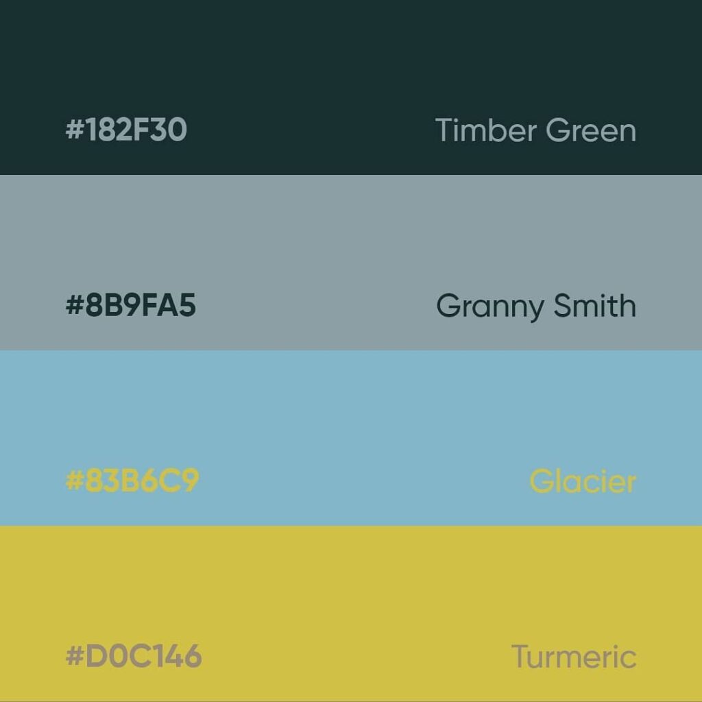
The two colors Turmeric and Glacier prevent excessive blurring of this color palette and are in contrast with other colors.

In this pellet, Biscay tints, complemented by Marigold Yellow, create an attractive contrast and convey a sense of confidence and originality.
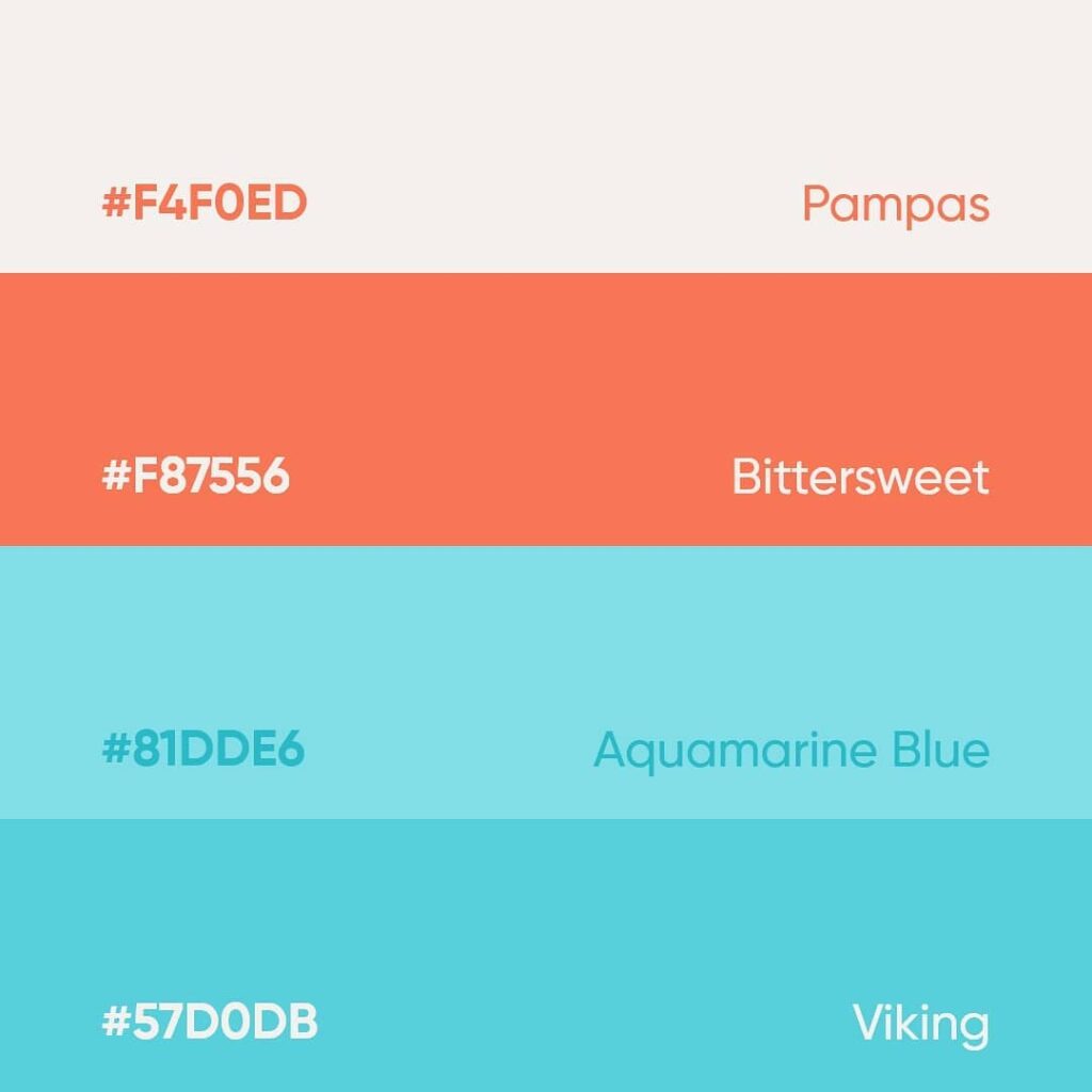
Complementary colors are used in this color palette, and Pampas color can also be selected as a background.

Dandelion and Rose convey a friendly feeling to the audience in this color palette.

Complementary colors Mulled Wine and Surfie Green create a beautiful contrast and the combination of all these colors gives a warm feeling to the audience.
Get inspired by nature for color pairing!

The presence of Spring Wood color along with other complementary colors adds calmness to this palette.

The colors of this palette complement each other in pairs, and this created a high contrast that attracts the eyes.

The combination of these colors together creates a special softness and causes a proper balance of these colors with each other.

The presence of exciting and joyful colors in this color palette has made it mesmerizing. And it is suitable for use in places that are related to a lot of excitement, and also evoked the autumn season.

This palette is almost a shadow of the previous palette tints. The difference is that this palette conveys a feeling of calm and peace and is suitable for the autumn season.
Using color pairing is not difficult!

The combination of warm and exciting colors of Lightning Yellow and Sunset Orange along with the cool colors in this palette, evoked the sunset in a cold season.

Tints of blue and yellow in this palette include calm, happiness and a positive feeling.

The Romanian flag has these three colors, and represents brotherhood, justice and freedom. This is a classic color combination and is one of the most popular color combinations. And it is very useful.

The presence of two warm colors against a cool color in this color palette creates high contrast, but due to the neutral Ivory color, this contrast is less visible.

This palette has shades of gray. Conveys excessive relaxation, it is also useful for use in the bedroom.
Conclusion
Whether you are a painter or fashion designer, photographer or interior designer, and even a mother looking for the right color combination to make your baby’s food more attractive, you need to know how to put colors together and create an attractive color palette.
Don’t worry, we’re here to help you. You can visit Dopely to make your new and favorite color palettes.
Well, now you tell me, what’s your favorite color palette?
Share your opinion with me in the comments!